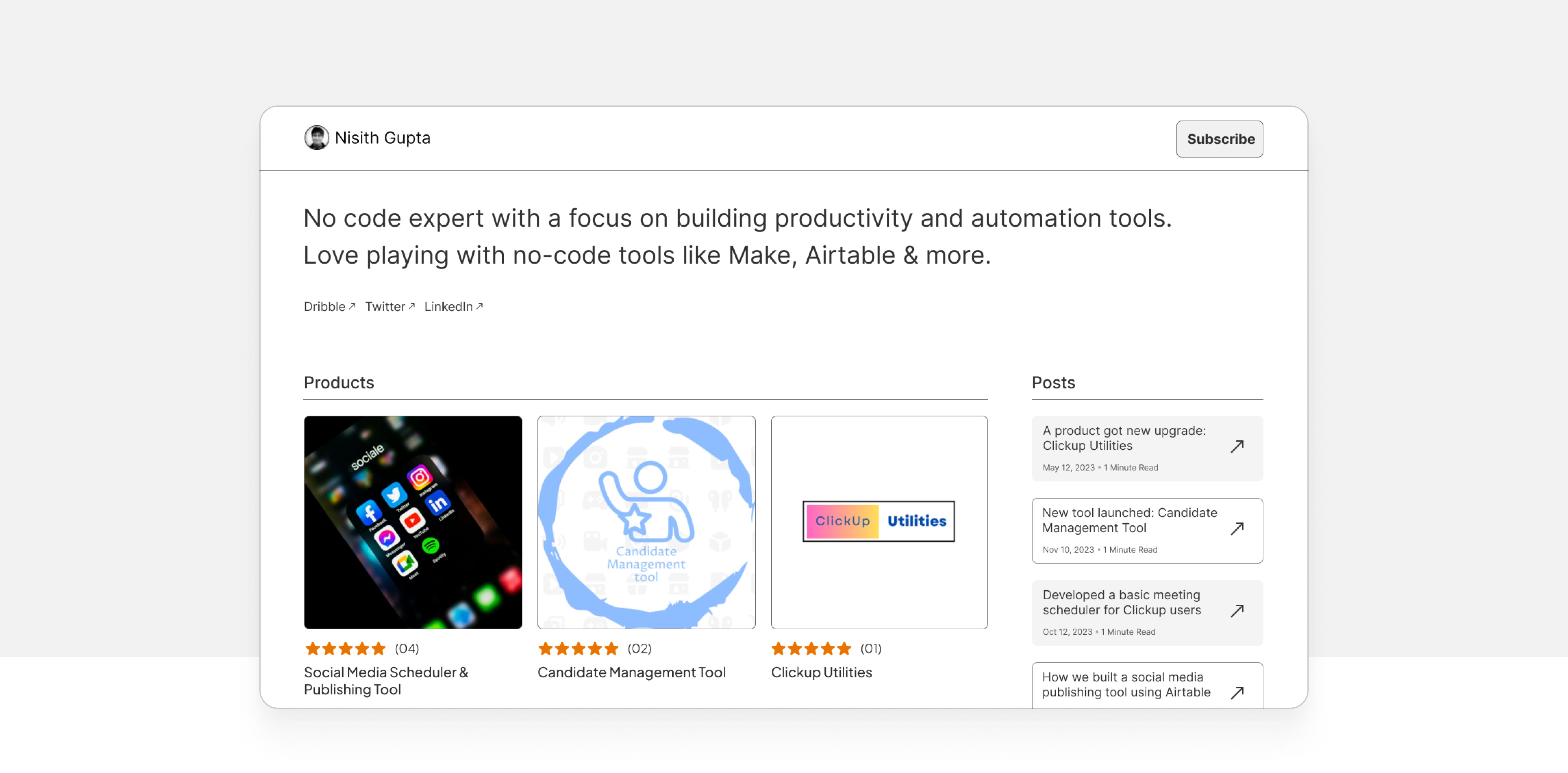


Gumroad Creators profile screen
Gumroad Creators profile screen
Improving the Creator’s profile screen (first fold) to ensure a visitor gets a good first impression of the creator.
Improving the Creator’s profile screen (first fold) to ensure a visitor gets a good first impression of the creator.
Hackathon
Hackathon
Hackathon
UI Design
UI Design
UI Design
UX Design
UX Design
Web Design
Web Design
E-Commerce
E-Commerce
Timeframe - 2 Days
Unsolicited Design
UI Design
UX Design
Web Design
Education
Timeframe - 1 Month
Timeframe - 1 Month
Timeframe - 1 Month
Timeframe - 1 Month
Summary
This was a Weekend Hackathon by UX Hack for improving ux and ui skills by solving real world products and the duration for this was only two days. I participated on weekend #6 which was for improving Gumroad creators profile screen and secured the second position for the competition. You can view the challenge here.
This was a Weekend Hackathon by UX Hack for improving ux and ui skills by solving real world products and the duration for this was only two days. I participated on weekend #6 which was for improving Gumroad creators profile screen and secured the second position for the competition. You can view the challenge here.
Hackathon Brief
Gumroad is an e-commerce marketplace where individuals and companies can sell digital goods such as Ebooks, Software licenses, Templates, Tutorials, and more. However, the current layout for creators is rigid and doesn’t do much justice in giving a good first impression (first fold).
Gumroad is an e-commerce marketplace where individuals and companies can sell digital goods such as Ebooks, Software licenses, Templates, Tutorials, and more. However, the current layout for creators is rigid and doesn’t do much justice in giving a good first impression (first fold).
Improve the Creator’s profile screen (first fold) to ensure a visitor gets a good first impression of the creator and makes them want to engage further i.e. either browse products, read their posts, or learn more about the Creator.
Improve the Creator’s profile screen (first fold) to ensure a visitor gets a good first impression of the creator and makes them want to engage further i.e. either browse products, read their posts, or learn more about the Creator.
Taking a look on the current scenario
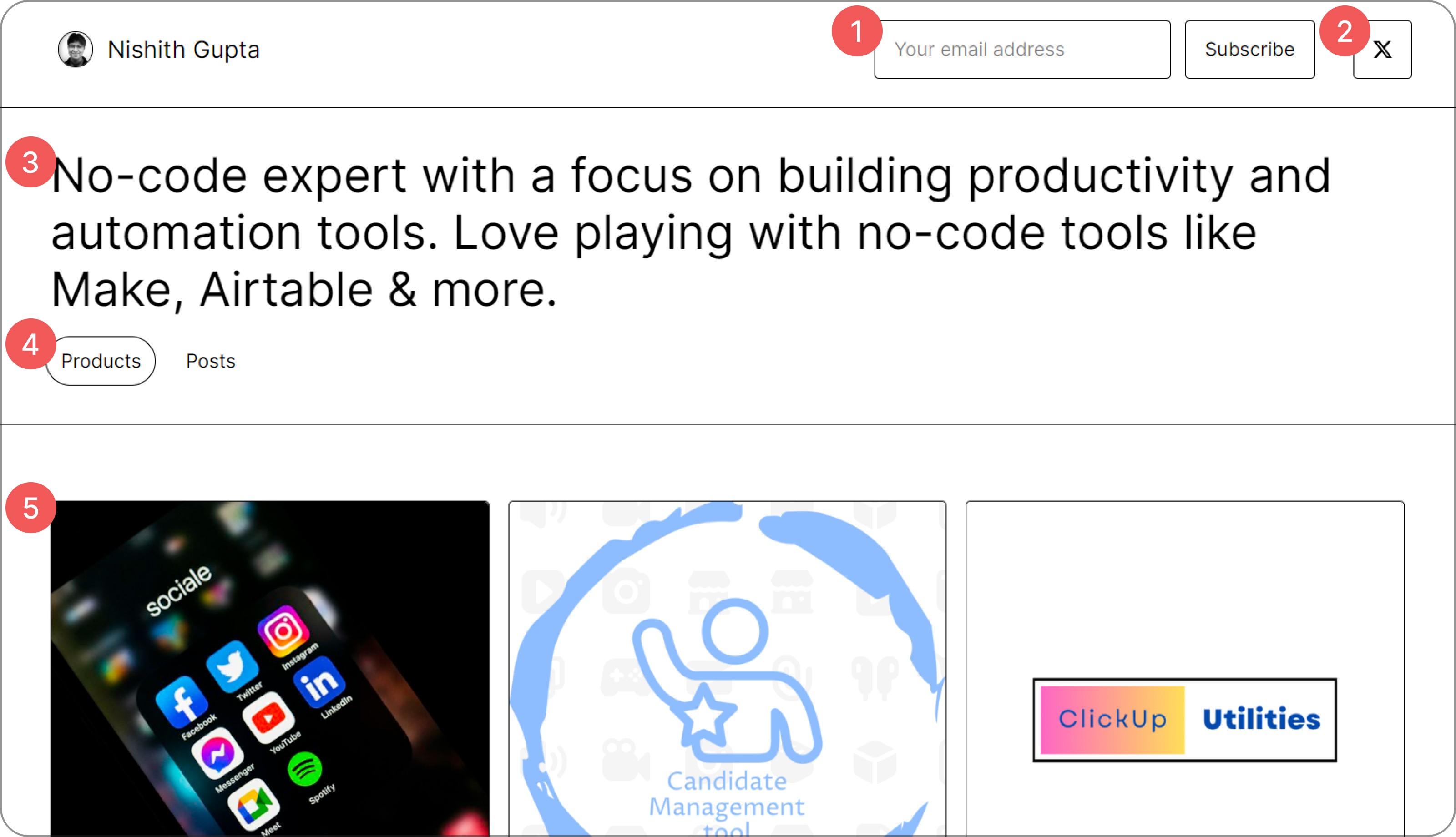


1
The top right corner with three boxes makes the layout fragmented.
The top right corner with three boxes makes the layout fragmented.
2
Twitter’s icon looks like a closing button since it’s placed at the default closing position and what if the users want to visit other platforms as well.
Twitter’s icon looks like a closing button since it’s placed at the default closing position and what if the users want to visit other platforms as well.
3
The creators statement takes up too much space and eats up the space available in the first fold.
The creators statement takes up too much space and eats up the space available in the first fold.
4
Products and posts button are far away from their content and use of separator line shows them to be different sections.
Products and posts button are far away from their content and use of separator line shows them to be different sections.
5
The products image is shown but no product name since the card size is big and covers the above the fold page of the creator.
The products image is shown but no product name since the card size is big and covers the above the fold page of the creator.
Setting the design scope
I decided to redesign the profile page focusing on three main points -
I decided to redesign the profile page focusing on three main points -
The design should not be too much different with the current one as too much change may confuse visitors and creators who are already using the product.
The visitor should get a glimpse of what the creator focuses on i.e. their statement and if their values align then they should have the option to know more about them and their work.
The page should also help the creators in building their expertise and credibility in their respective fields. This means maintaining the simplicity and straightforward approach for achieving the platforms main job which is to sell products.
Starting the Designs
With the design scope set, I started with the low fidelity designs to experiment with page layout.
With the design scope set, I started with the low fidelity designs to experiment with page layout.
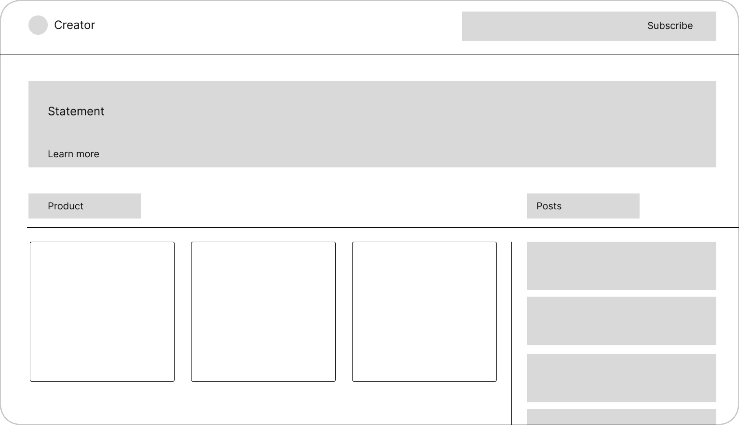


option 1
At top right corner we have separate subscribe button with email address.
At top right corner we have separate subscribe button with email address.
Creators statement with Learn more link for more information.
Creators statement with Learn more link for more information.
Product and posts section are moved below with their own section.
Product and posts section are moved below with their own section.
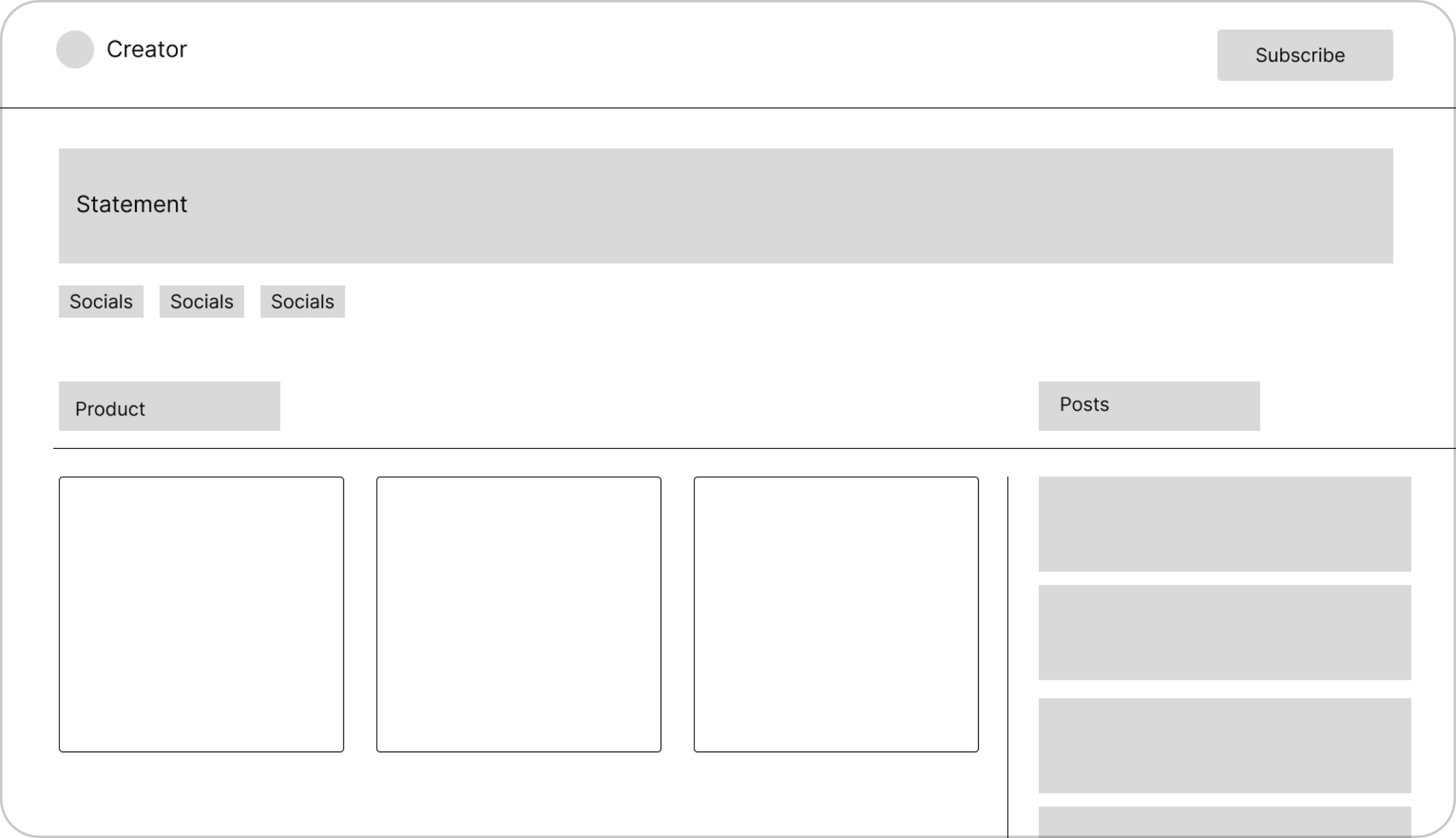


option 2
At top right corner we now have a single subscribe button which will directly subscribe to the creator.
At top right corner we now have a single subscribe button which will directly subscribe to the creator.
Under the statement we have direct links to their socials.
Under the statement we have direct links to their socials.
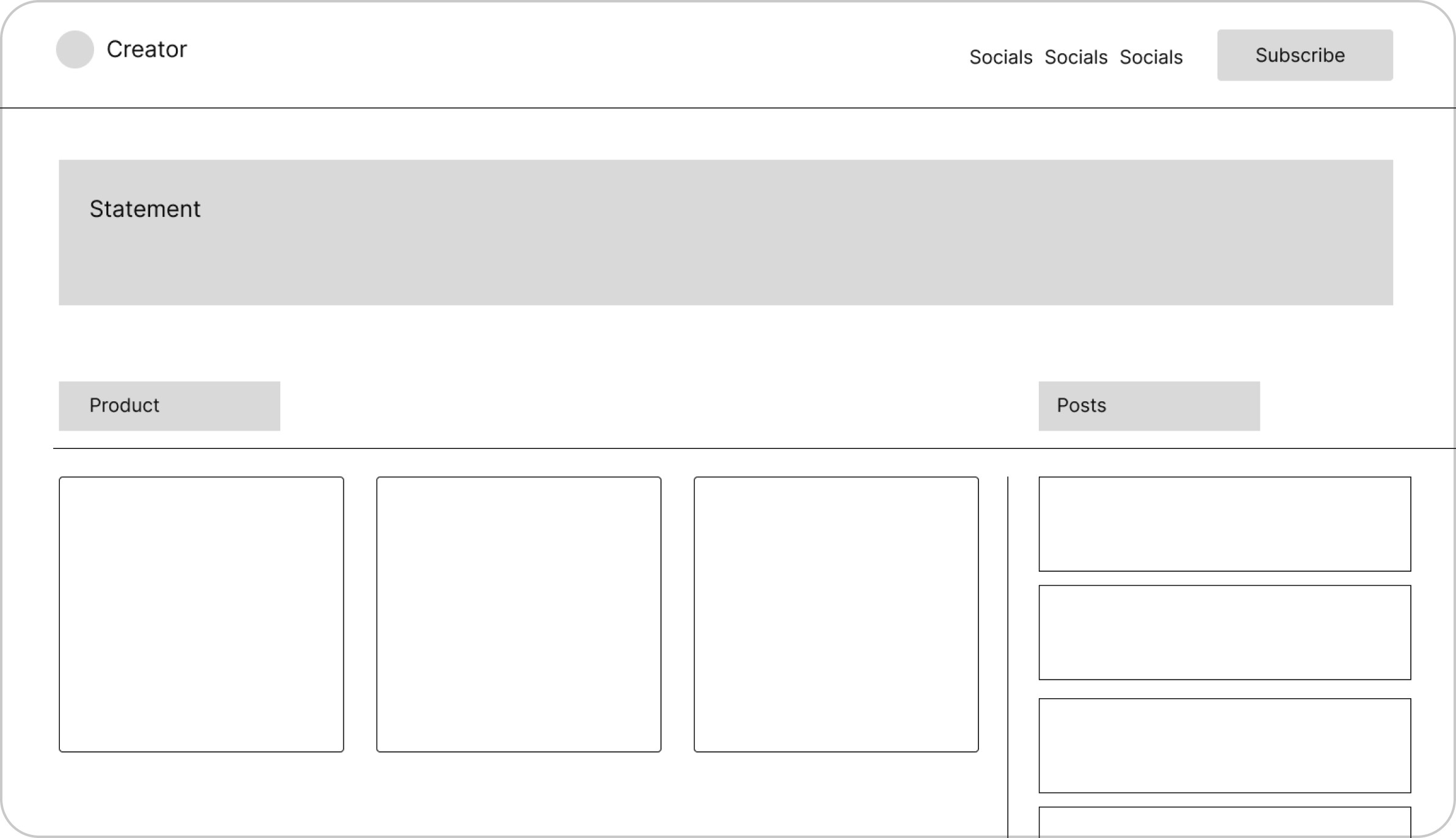


option 3
Now we have socials along with subscribe button at top right corner.
Now we have socials along with subscribe button at top right corner.
Statement for the creators have more space to explain their vision.
Statement for the creators have more space to explain their vision.
I experimented the solid filled background for card design for posts to be in outline.
I experimented the solid filled background for card design for posts to be in outline.
I decided to go with the second design as the visitors will have a clear movement when they read the creators statement, then they can visit to other socials to know more about them. This layout also have a simple and clear subscribe button cta for the visitors.
I decided to go with the second design as the visitors will have a clear movement when they read the creators statement, then they can visit to other socials to know more about them. This layout also have a simple and clear subscribe button cta for the visitors.
Pushing to high fidelity designs
After making low fidelity screens, I started turning them to high fidelity designs. I separated the Products and Posts section for more differentiation between them and designed the card in detail for Posts sections.
After making low fidelity screens, I started turning them to high fidelity designs. I separated the Products and Posts section for more differentiation between them and designed the card in detail for Posts sections.
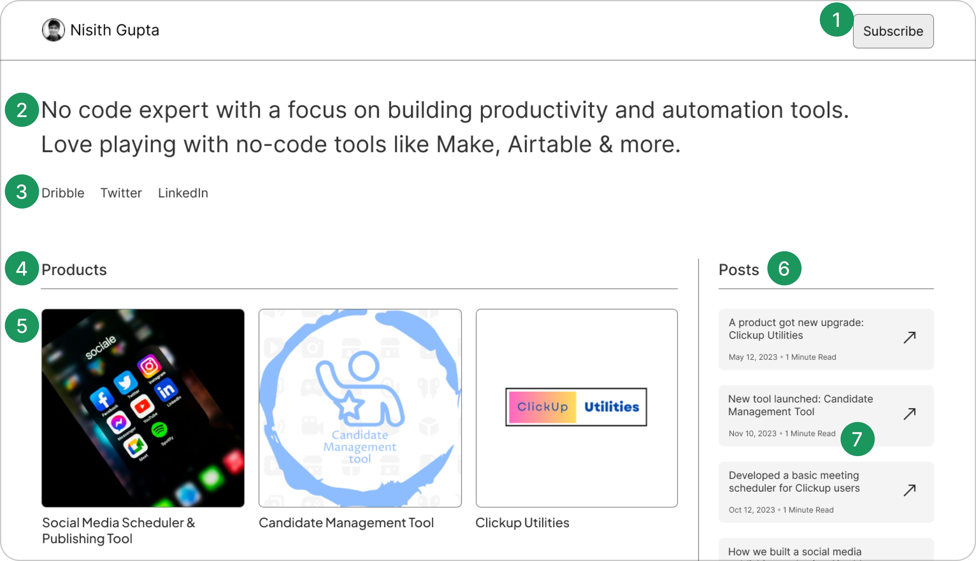


1
Only one element is placed at the top right corner for subscribing (main cta) reducing any confusion.
Only one element is placed at the top right corner for subscribing (main cta) reducing any confusion.
2
The creators statement font size was reduced for more space to other elements.
The creators statement font size was reduced for more space to other elements.
3
The socials are moved to bottom of the statement for learning more about the creator.
The socials are moved to bottom of the statement for learning more about the creator.
4
Products and Posts are now closer to their content and separated into their own sections.
Products and Posts are now closer to their content and separated into their own sections.
5
The product image is now smaller for better visibility with description.
The product image is now smaller for better visibility with description.
6
Posts are now shown with the products page to establish the creators expertise at first glance.
Posts are now shown with the products page to establish the creators expertise at first glance.
7
Posts card are now shown with reading time so that if the visitor wants to read them, they will know how much time will it take.
Posts card are now shown with reading time so that if the visitor wants to read them, they will know how much time will it take.
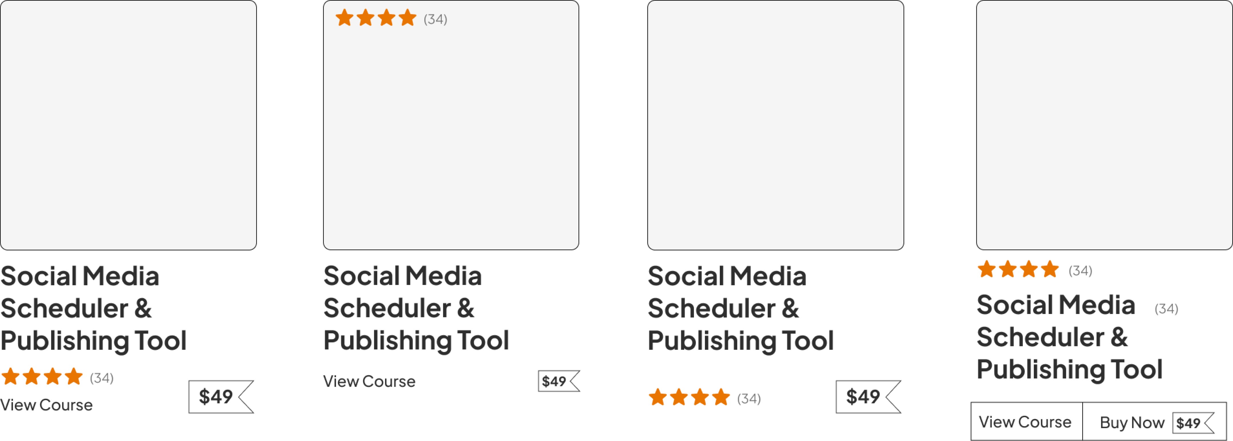
I explored several versions of how the product card should look like.
I explored different versions of how the product card should look like.


After making the high fidelity, I explored another option for the creators page with small change like posts having card with strokes and the product card with ratings at top.
After making the high fidelity, I explored another option for the creators page with small change like posts having card with strokes and the product card with ratings at top.
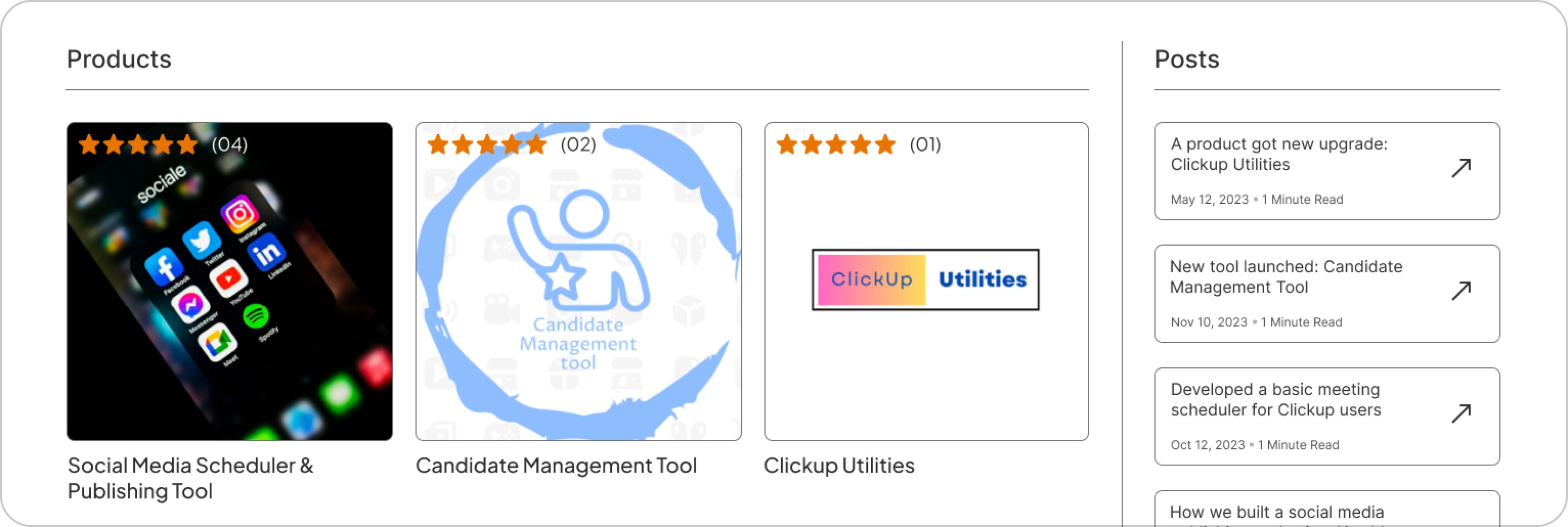


I did not went with this design for two reasons -
The ratings may cause contrast issues with the product image and can obstruct the image as well.
Posts with outlined card had too much lines and boxes.
I did not went with this design for two reasons -
The ratings may cause contrast issues with the product image and can obstruct the image as well.
Posts with outlined card had too much lines and boxes.
Final design
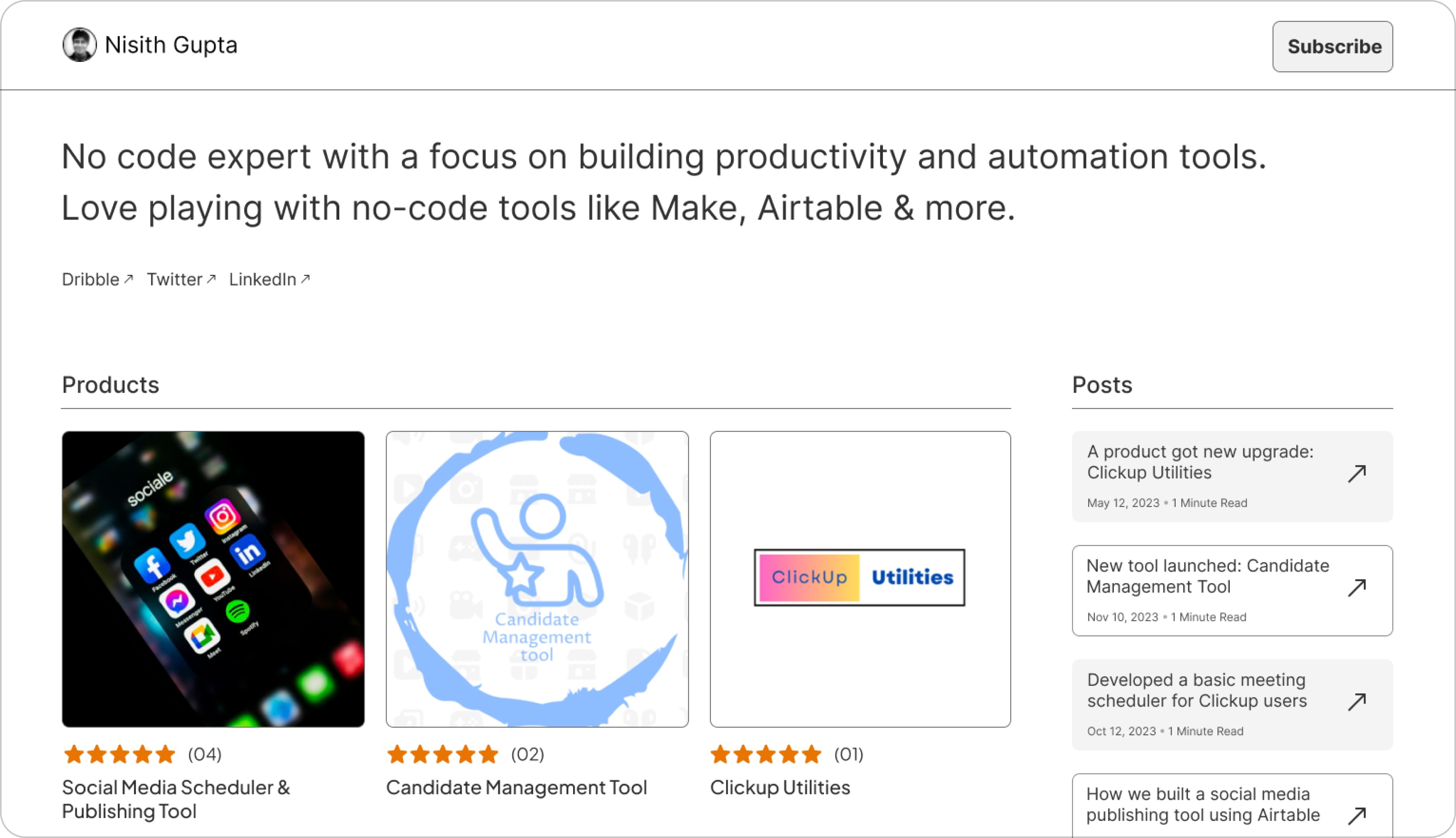
Before submitting the design, I decided to make the card design for post to be alternatively outlined and filled to make it more interesting. Ratings for the products were placed under the image to create positive effect on the first time visitors.
Before submitting the design, I decided to make the card design for post to be alternatively outlined and filled to make it more interesting. Ratings for the products were placed under the image to create positive effect on the first time visitors.


Conclusion
The challenge was a great opportunity to increase skills and develop critical thinking under two days. Continuous iterations of the designs and thoughtful decisions are crucial for the development of the product.
The challenge was a great opportunity to increase skills and develop critical thinking under two days. Continuous iterations of the designs and thoughtful decisions are crucial for the development of the product.
One thing that I could try is to add buyers testimonial to the page which would help in establishing the creators credibility. Other would to be add stats for the creators profile.
One thing that I could try is to add buyers testimonial to the page which would help in establishing the creators credibility. Other would to be add stats for the creators profile.
Let’s Chat and
Collaborate
I'd love to learn more about you and what we can design and build together.
Thanks for the visit. Have a Nice day!
Let’s Chat and Collaborate
I'd love to learn more about you and what we can design and build together.
Thanks for the visit. Have a Nice day!
Let’s Chat and
Collaborate
I'd love to learn more about you and what we can design and build together.
Thanks for the visit. Have a Nice day!