

Subscription Manager
Subscription Manager
Helping users manage their spending on subscriptions and taking charge of their finances.
Helping users manage their spending on subscriptions and taking charge of their finances.
Timeframe - 3 Months
Finance
Unsolicited Redesign
Unsolicited Redesign
UX Design
UX Design
UI Design
UI Design
Android
Android
Finance
Finance
Timeframe - 3 Months
UX Design
Unsolicited Redesign
UI Design
Android
Finance
Timeframe - 3 Months
Android
Finance
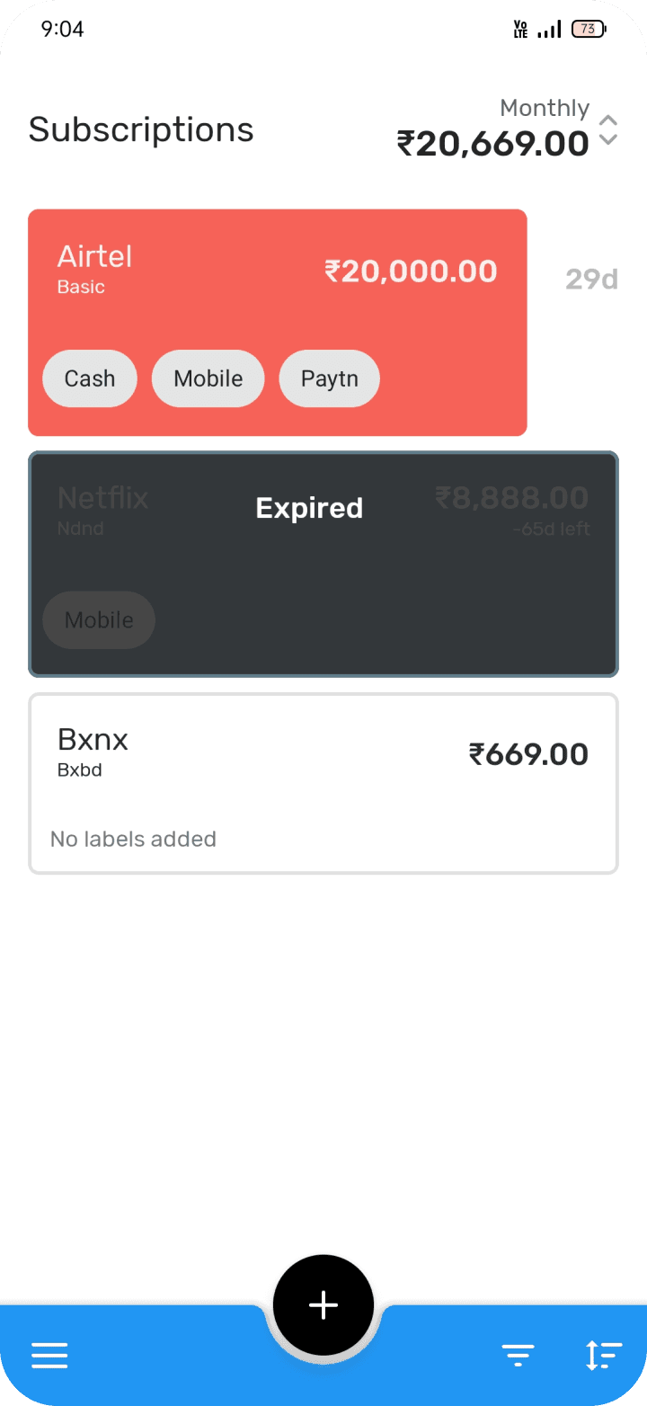
before
before




after
after




Summary
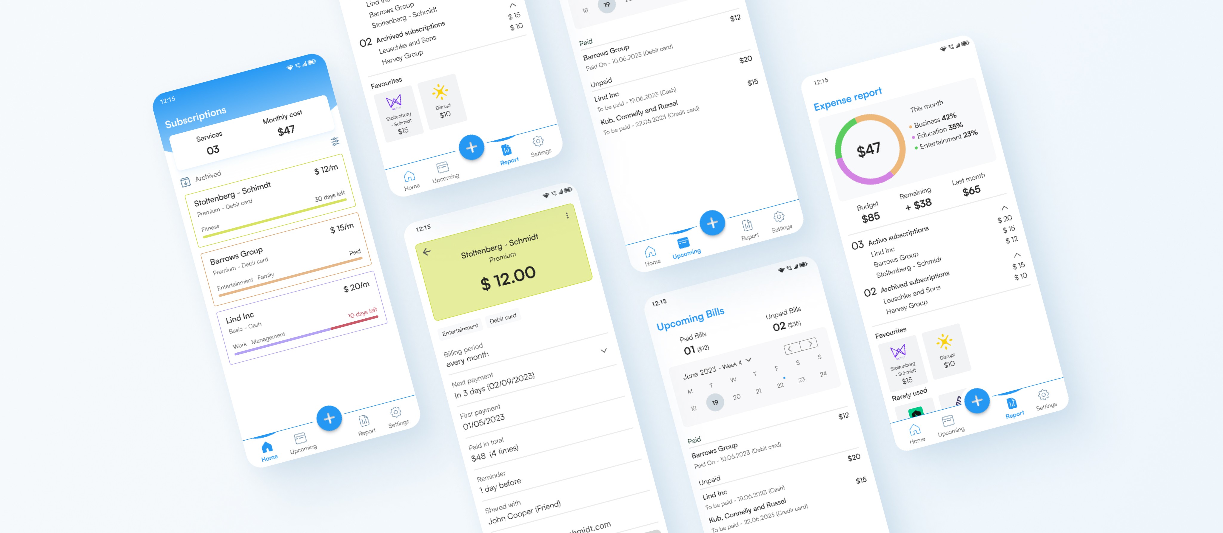
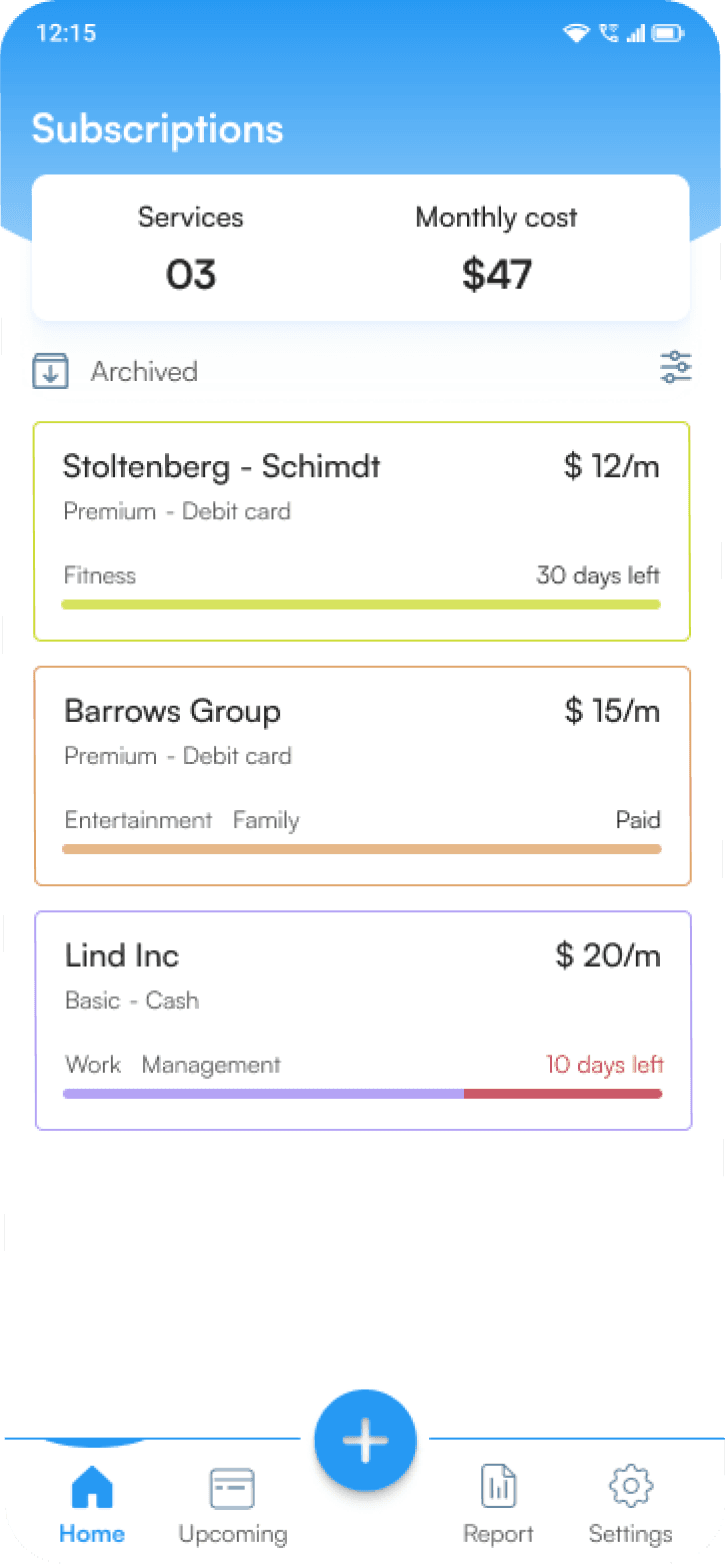
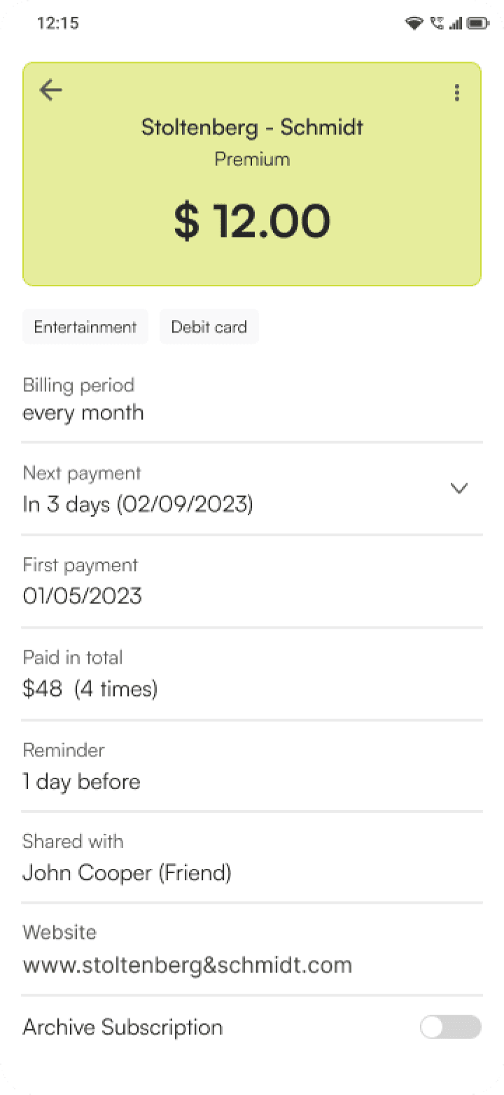
The current app has a home screen showing subscriptions only. It doesn't show how much one is spending on the services. I introduced the scan OCR feature to add services much faster than before. The addition of upcoming bills and reports helped users to manage their finances. Improved visuals and more information on their bills increased usability and brought clarity to users.
The current app has a home screen showing subscriptions only. It doesn't show how much one is spending on the services. I introduced the scan OCR feature to add services much faster than before.
The addition of upcoming bills and reports helped users to manage their finances. Improved visuals and more information on their bills increased usability and brought clarity to users.
The current app has a home screen showing subscriptions only. It doesn't show how much one is spending on the services. I introduced the scan OCR feature to add services much faster than before. The addition of upcoming bills and reports helped users to manage their finances. Improved visuals and more information on their bills increased usability and brought clarity to users.
Subscription models are now adopted by businesses to keep customers. This will be growing in the coming years as well. And to keep up with the needs users buy services. But to maintain them is something else.
Subscription models are now adopted by businesses to keep customers. This will be growing in the coming years as well. And to keep up with the needs users buy services. But to maintain them is something else.
Subscription models are now adopted by businesses to keep customers. This will be growing in the coming years as well. And to keep up with the needs users buy services. But to maintain them is something else.
This caused a great pain in users finances. Writing it down on notes can become a tedious task and won’t tell you how much and when the service is going to end.
This caused a great pain in users finances.
Writing it down on notes can become a tedious task and won’t tell you how much and when the service is going to end.
This caused a great pain in users finances. Writing it down on notes can become a tedious task and won’t tell you how much and when the service is going to end.
"The only thing we are reminded of is notification from the company that money has been deducted from our account or we have not paid for the service for our continuous usage."
"The only thing we are reminded of is notification from the company that money has been deducted from our account or we have not paid for the service for our continuous usage."
"The only thing we are reminded of is notification from the company that money has been deducted from our account or we have not paid for the service for our continuous usage."
Discovering the Issue
I interviewed three people and surveyed to understand the problem. Doing secondary research helped in understanding what other apps are being used and how they work.
I interviewed three people and surveyed to understand the problem. Doing secondary research helped in understanding what other apps are being used and how they work.
I interviewed three people and surveyed to understand the problem. Doing secondary research helped in understanding what other apps are being used and how they work.
"When I plan my finances, I want to be able to see all the services I have subscribed to in order to plan budgets for what’s a priority and what’s not."
"When I plan my finances, I want to be able to see all the services I have subscribed to in order to plan budgets for what’s a priority and what’s not."
"When I plan my finances, I want to be able to see all the services I have subscribed to in order to plan budgets for what’s a priority and what’s not."
"Subscription ends on different days of the month, making payments irregular. Hard to keep track of subscription services."
"Subscription ends on different days of the month, making payments irregular. Hard to keep track of subscription services."
"Subscription ends on different days of the month, making payments irregular. Hard to keep track of subscription services."
Key point that were recurring after my observations.:
Key point that were recurring after my observations.:
Key point that were recurring after my observations.:
They had difficulty in managing subscriptions due to different date renewals.
They had difficulty in managing subscriptions due to different date renewals.
They had difficulty in managing subscriptions due to different date renewals.
They want to see all subscribed services to plan their budgets for the next month.
They want to see all subscribed services to plan their budgets for the next month.
They want to see all subscribed services to plan their budgets for the next month.

Many of them miss the expiry date and are notified after deductions or the service is terminated.
They had difficulty in managing subscriptions due to different date renewals
Many of them miss the expiry date and are notified after deductions or the service is terminated.
Many of them do not want to overspend money on subscription services. Some are used less and adds to expenses.
Many of them do not want to overspend money on subscription services. Some are used less and adds to expenses.
Many of them do not want to overspend money on subscription services. Some are used less and adds to expenses.
Developing user stories to understand requirements for our product
Developing user stories to understand requirements for our product
Developing user stories to understand requirements for our product
"The user wants to know subscriptions being used to decide which services to continue using. This would help them to manage their finances and feel less anxious"
"The user wants to know subscriptions being used to decide which services to continue using. This would help them to manage their finances and feel less anxious"
"The user wants to know subscriptions being used to decide which services to continue using. This would help them to manage their finances and feel less anxious"
"The users wants to add services they are using with important information and wants to get reminded on time before their expiration. This would help users to prevent overspending on subscriptions.
"The users wants to add services they are using with important information and wants to get reminded on time before their expiration. This would help users to prevent overspending on subscriptions.
"The users wants to add services they are using with important information and wants to get reminded on time before their expiration. This would help users to prevent overspending on subscriptions.
Problem statement
Problem statement
Problem statement
Users are subscribed to many services but often they pay more than they wanted to. Because its hard to keep track of all the services and many of them miss the due date causing frustrations leading to more expenses.
Users are subscribed to many services but often they pay more than they wanted to. Because its hard to keep track of all the services and many of them miss the due date causing frustrations leading to more expenses.
Users are subscribed to many services but often they pay more than they wanted to. Because its hard to keep track of all the services and many of them miss the due date causing frustrations leading to more expenses.
Understanding the competition
(Direct competitor)

Tilla subscriptions manager
(Direct competitor)

SubX
(Indirect competitor)

Money Manager Expense & Budget
(Direct competitor)


Tilla subscriptions manager
(Direct competitor)


SubX
(Indirect competitor)


Money Manager Expense & Budget
Two direct competitors and one indirect competitor were selected. They were analyzed based on three questions -
Two direct competitors and one indirect competitor were selected. They were analyzed based on three questions -
Two direct competitors and one indirect competitor were selected. They were analyzed based on three questions -
How it helps in managing subscription services?
How it helps in managing subscription services?
How it helps in managing subscription services?
How it helps in informing the users for the services they are using?
How it helps in informing the users for the services they are using?
How it helps in informing the users for the services they are using?
How it helps in managing their Finances?
How it helps in managing their Finances?
How it helps in managing their Finances?
The Good
The Good
Pre made template available for adding.
Pre made template available for adding.
Pre made template available for adding.
Separate Bill tab which has calendar view with next due bills to pay.
Separate Bill tab which has calendar view with next due bills to pay.
Separate Bill tab which has calendar view with next due bills to pay.
Stats shows expenses and income in pie chart or bar chart form as per category and has filters.
Stats shows expenses and income in pie chart or bar chart form as per category and has filters.
Stats shows expenses and income in pie chart or bar chart form as per category and has filters.
Has Calendar view with expenses, income and total amount spent.
Has Calendar view with expenses, income and total amount spent.
Has Calendar view with expenses, income and total amount spent.
The Bad
The Bad
Too many options can be confusing
Too many options can be confusing
Too many options can be confusing
No option to mark whether the service has been paid or not
No option to mark whether the service has been paid or not
No option to mark whether the service has been paid or not
No differentiation between active, inactive or canceled service can be found clearly
No differentiation between active, inactive or canceled service can be found clearly
No differentiation between active, inactive or canceled service can be found clearly
So what’s the current scenario?
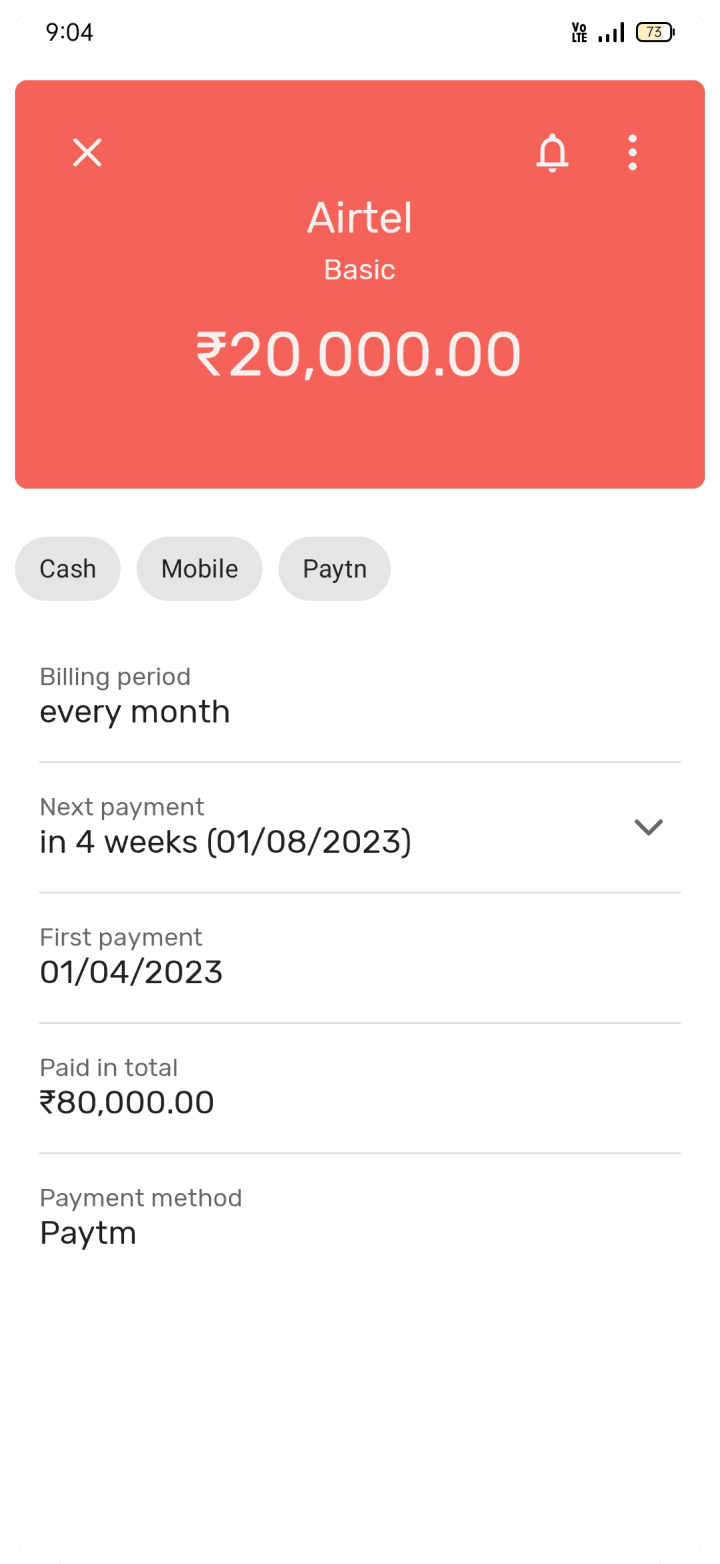
I started with finding what was missing in the current version of the app - Subscriptions-Manage your expenses.
I started with finding what was missing in the current version of the app - Subscriptions-Manage your expenses.
I started with finding what was missing in the current version of the app - Subscriptions-Manage your expenses.


Monthly cost was provided but was not explained in detail.
Monthly cost was provided but was not explained in detail.
Monthly cost was provided but was not explained in detail.
The Bottom navigation bar have icons with no clear representation of what icons are being used for.
The Bottom navigation bar have icons with no clear representation of what icons are being used for.
The Bottom navigation bar have icons with no clear representation of what icons are being used for.
The app did not have any upcoming and report option to know what and how much you are spending.
The app did not have any upcoming and report option to know what and how much you are spending.
The app did not have any upcoming and report option to know what and how much you are spending.
To set reminders, one has to set it after saving the subscription service which was not available while saving.
To set reminders, one has to set it after saving the subscription service which was not available while saving.
To set reminders, one has to set it after saving the subscription service which was not available while saving.
The filter options were confusing and one has to open bottom sheet to view archived subscriptions.
The filter options were confusing and one has to open bottom sheet to view archived subscriptions.
The filter options were confusing and one has to open bottom sheet to view archived subscriptions.
Deciding what to Build - Exploring Ideas
I decided to design features from the insights and what the app was missing to fulfill users needs and frustrations.
I decided to design features from the insights and what the app was missing to fulfill users needs and frustrations.
I decided to design features from the insights and what the app was missing to fulfill users needs and frustrations.
Improving the Home screen design with better visuals for subscription card.
Improving the Home screen design with better visuals for subscription card.
Improving the Home screen design with better visuals for subscription card.
Adding new fields so that the user might not forget important information .
Adding new fields so that the user might not forget important information .
Adding new fields so that the user might not forget important information .
Upcoming bills - which are paid and which are not with total amount paid.
Upcoming bills - which are paid and which are not with total amount paid.
Upcoming bills - which are paid and which are not with total amount paid.
Report tab to see monthly analysis and which subscriptions are contributing how much to their expenses.
Report tab to see monthly analysis and which subscriptions are contributing how much to their expenses.
Report tab to see monthly analysis and which subscriptions are contributing how much to their expenses.
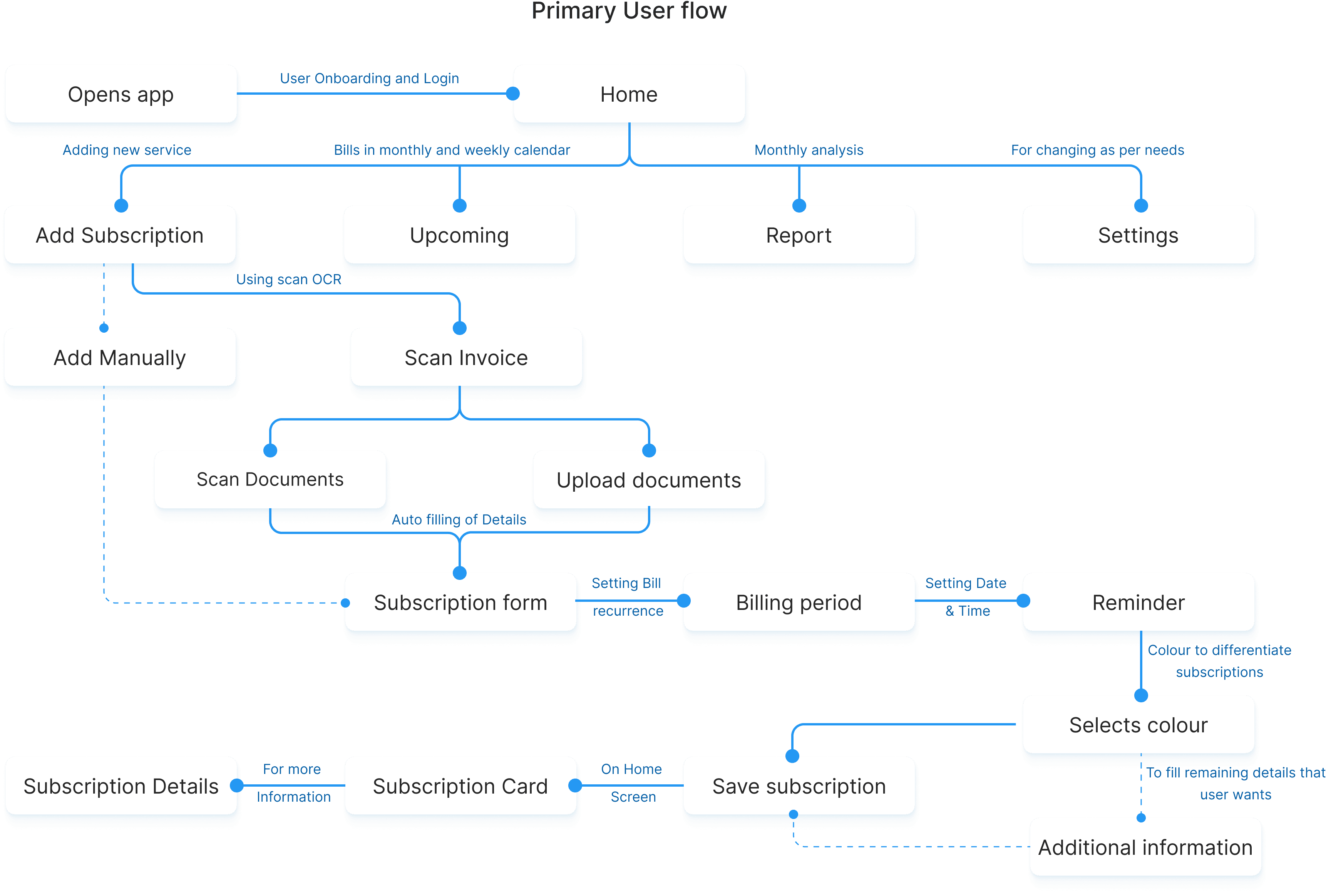
I started creating a primary user flow for the above features within the app. This will help in understanding how the app will work and would give a starting point for creating low-fidelity wireframes.
I started creating a primary user flow for the above features within the app. This will help in understanding how the app will work and would give a starting point for creating low-fidelity wireframes.
I started creating a primary user flow for the above features within the app. This will help in understanding how the app will work and would give a starting point for creating low-fidelity wireframes.


Low-fidelity wireframes
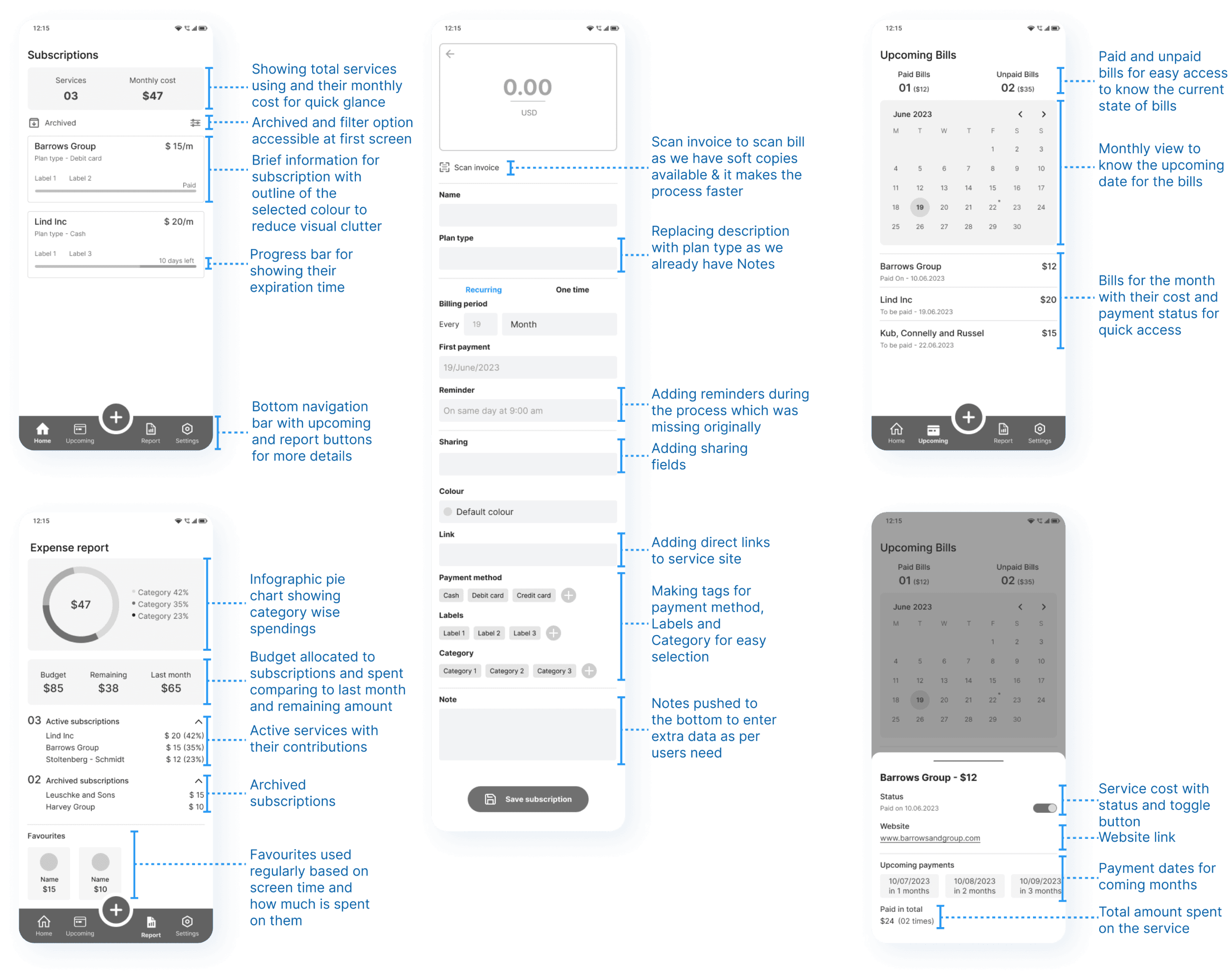
Once the User flow diagram was established, I started creating low fidelity wireframes.
Once the User flow diagram was established, I started creating low fidelity wireframes.
Once the User flow diagram was established, I started creating low fidelity wireframes.
First Iteration
First Iteration
First Iteration


Second Iteration
Second Iteration
Second Iteration


Testing with Users
After creating low fidelity prototype, I started my first user testing to understand how they will use the app and achieve their needs. They were given three main task to fit as per our user stories.
After creating low fidelity prototype, I started my first user testing to understand how they will use the app and achieve their needs. They were given three main task to fit as per our user stories.
After creating low fidelity prototype, I started my first user testing to understand how they will use the app and achieve their needs. They were given three main task to fit as per our user stories.
Scan invoice was preferred for hassle free filling of details but they also mentioned that it was not prominent.
Scan invoice was preferred for hassle free filling of details but they also mentioned that it was not prominent.
Scan invoice was preferred for hassle free filling of details but they also mentioned that it was not prominent.
Filling of the fields became a lengthy process especially when done manually resulted in leaving the task unfinished.
Filling of the fields became a lengthy process especially when done manually resulted in leaving the task unfinished.
Filling of the fields became a lengthy process especially when done manually resulted in leaving the task unfinished.
Users had to scroll all the way down to save the subscription as it was not visible on saving screen.
Users had to scroll all the way down to save the subscription as it was not visible on saving screen.
Users had to scroll all the way down to save the subscription as it was not visible on saving screen.
2 out of 6 users mentioned they do not require the whole month view.
2 out of 6 users mentioned they do not require the whole month view.
2 out of 6 users mentioned they do not require the whole month view.
4 out of 6 users mentioned they would be able to manage their finances by looking at the expense report.
4 out of 6 users mentioned they would be able to manage their finances by looking at the expense report.
4 out of 6 users mentioned they would be able to manage their finances by looking at the expense report.
5 out of 6 users mentioned they would like to know subscriptions which they are using rarely.
5 out of 6 users mentioned they would like to know subscriptions which they are using rarely.
5 out of 6 users mentioned they would like to know subscriptions which they are using rarely.
High-fidelity UI Design
After getting user feedback, I started reiterating on low-fidelity designs. This time I focused on scan invoice option improving the form fields and introduced user onboarding for new users. Once this was completed I started high fidelity screens by defining colours and fonts.
After getting user feedback, I started reiterating on low-fidelity designs. This time I focused on scan invoice option improving the form fields and introduced user onboarding for new users. Once this was completed I started high fidelity screens by defining colours and fonts.
After getting user feedback, I started reiterating on low-fidelity designs. This time I focused on scan invoice option improving the form fields and introduced user onboarding for new users. Once this was completed I started high fidelity screens by defining colours and fonts.
Colour palette
Colour palette
Brand, Primary, Secondary, Icons, Background
Brand, Primary, Secondary, Icons, Background
Font
Font
Satoshi - Regular, Medium and Bold
Satoshi - Regular, Medium and Bold
AaBbCcDdEeFfGgHh
AaBbCcDdEeFfGgHh
AaBbCcDdEeFfGgHh
After getting user feedback, I started reiterating on low-fidelity designs. This time I focused on scan invoice option improving the form fields and introduced user onboarding for new users. Once this was completed I started high fidelity screens by defining colours and fonts.
After getting user feedback, I started reiterating on low-fidelity designs. This time I focused on scan invoice option improving the form fields and introduced user onboarding for new users. Once this was completed I started high fidelity screens by defining colours and fonts.
After getting user feedback, I started reiterating on low-fidelity designs. This time I focused on scan invoice option improving the form fields and introduced user onboarding for new users. Once this was completed I started high fidelity screens by defining colours and fonts.
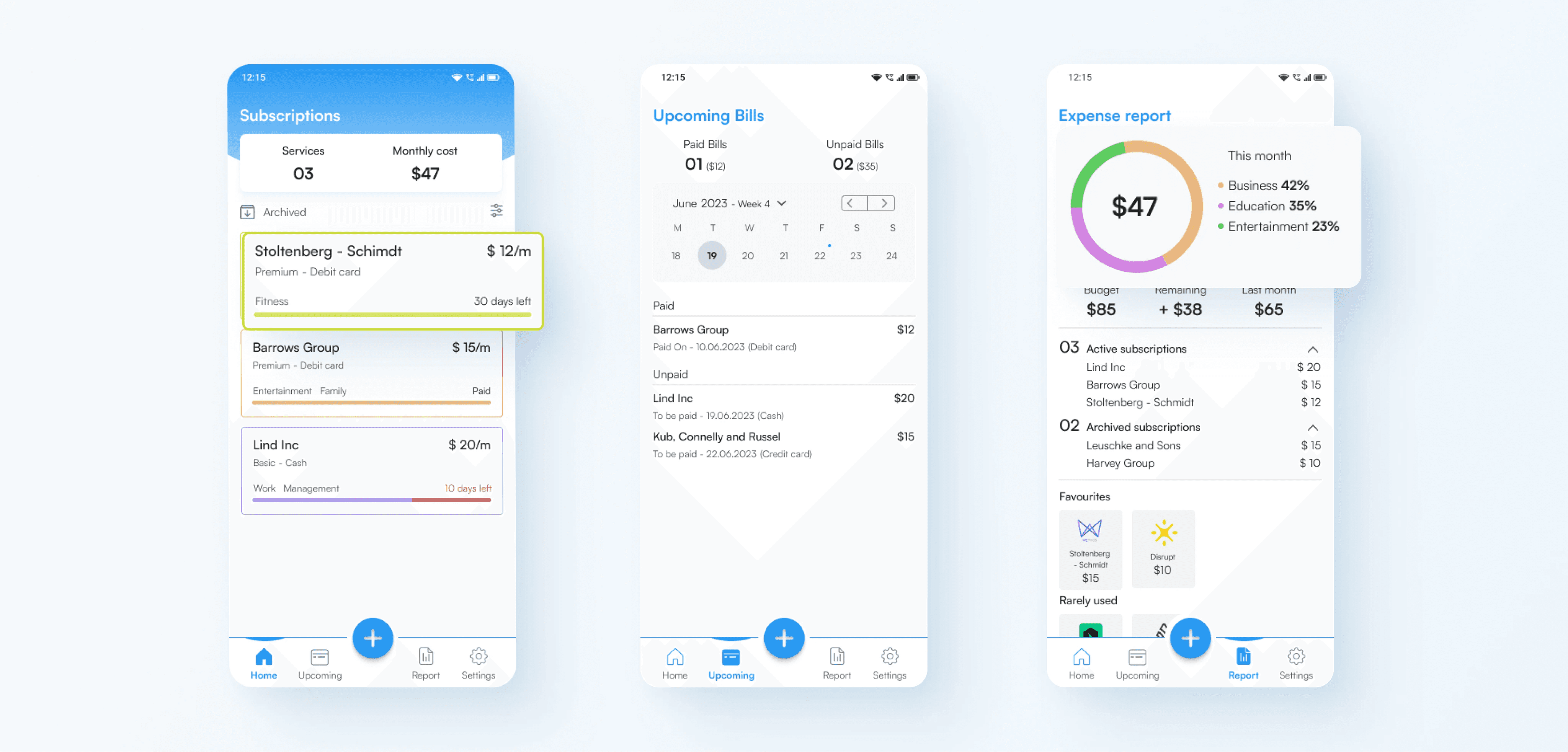
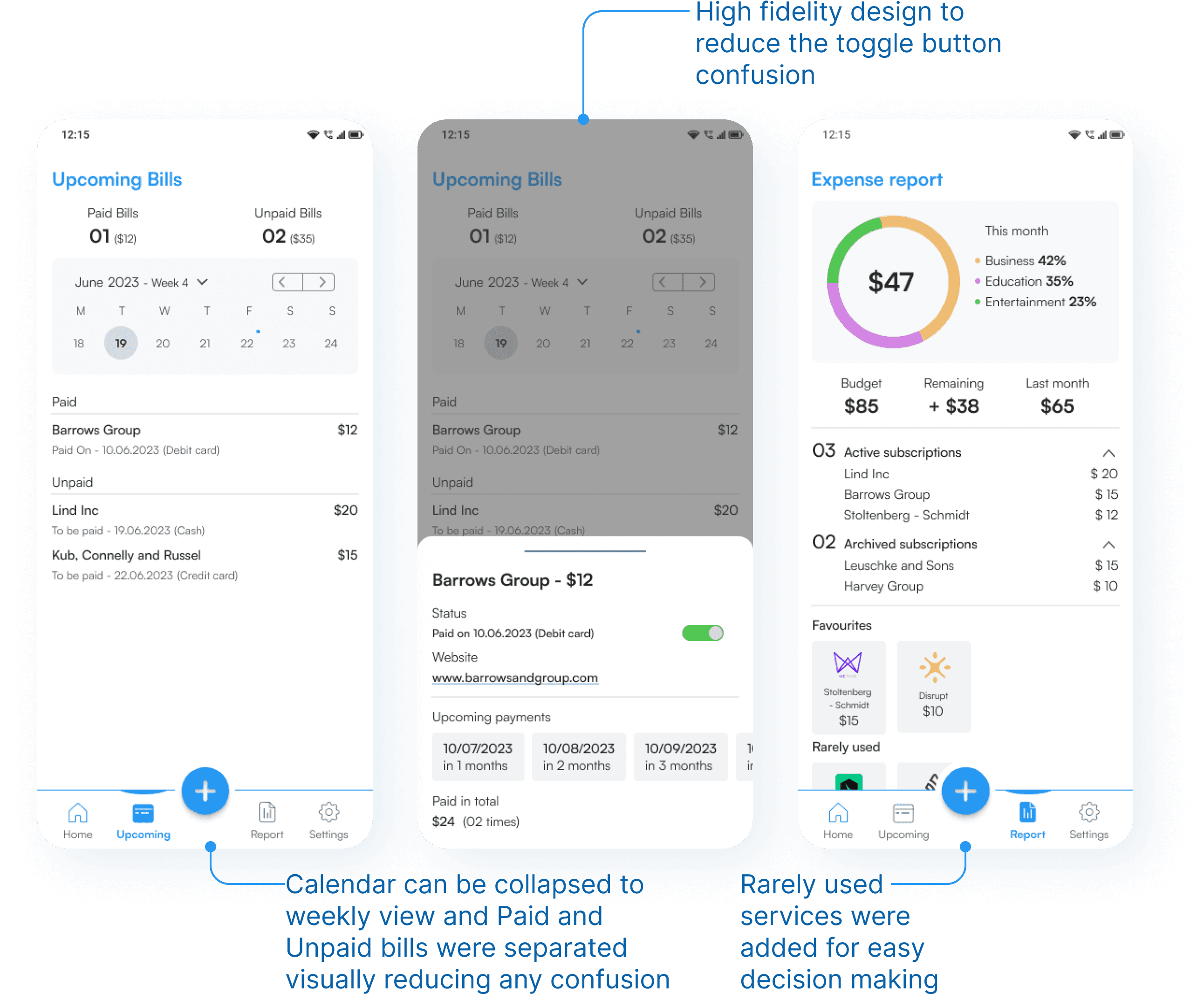
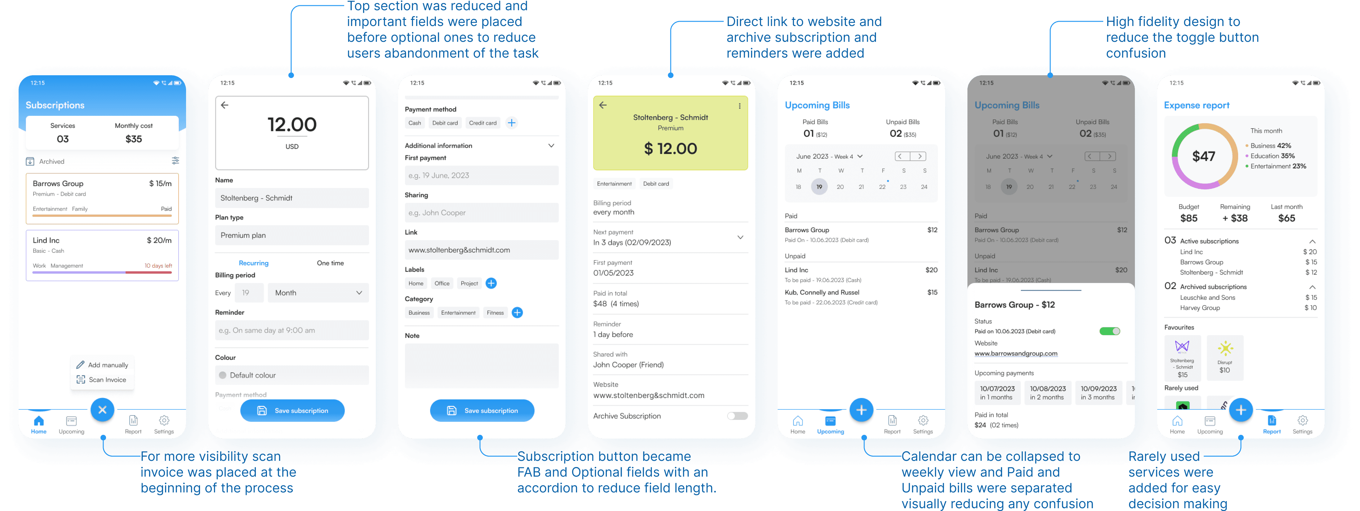
15 High fidelity designs were created after taking feedback from the users and incorporated in the designs to improve the layout and experience. I decided to focus on scanning the invoice as it was more favoured by the users and tried three different bottom navigation options to help users identify the current screen they are on.
15 High fidelity designs were created after taking feedback from the users and incorporated in the designs to improve the layout and experience. I decided to focus on scanning the invoice as it was more favoured by the users and tried three different bottom navigation options to help users identify the current screen they are on.
15 High fidelity designs were created after taking feedback from the users and incorporated in the designs to improve the layout and experience. I decided to focus on scanning the invoice as it was more favoured by the users and tried three different bottom navigation options to help users identify the current screen they are on.



Alignment and Grids
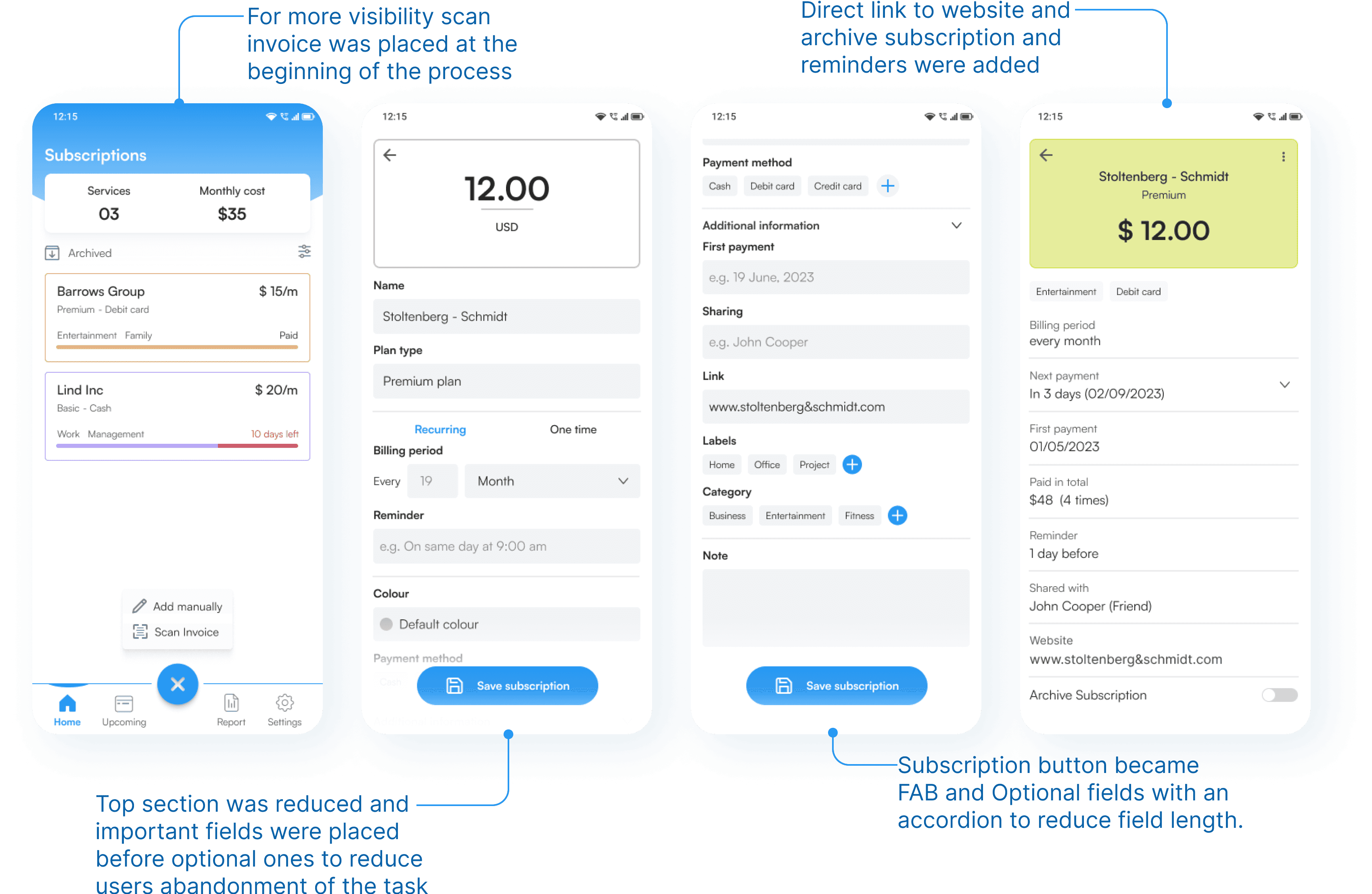
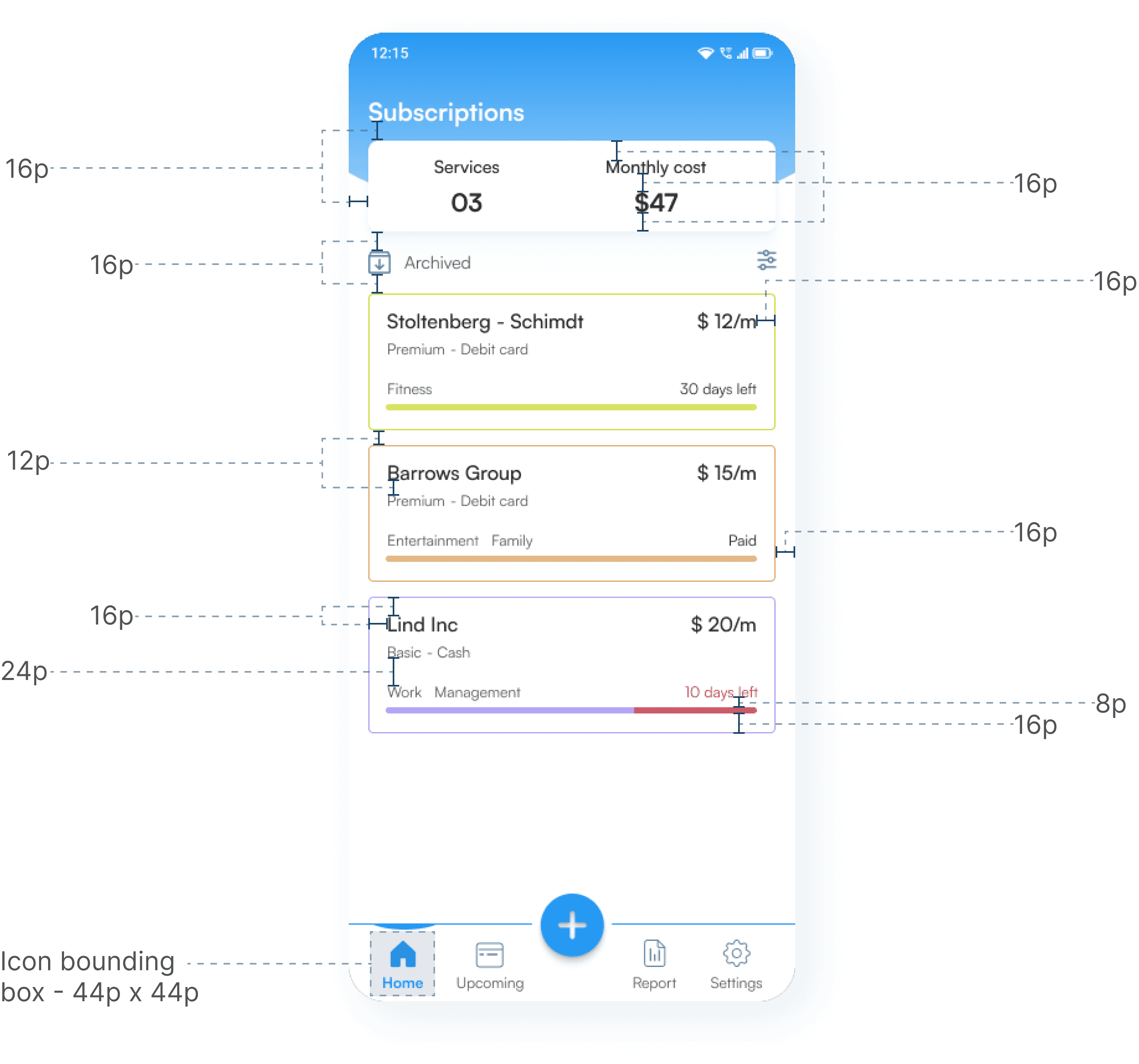
I picked the 8 point grid system for the project. Within the group, I set the margins at 8 and 16 with margins between groups at 24, 32 and 48.
I picked the 8 point grid system for the project. Within the group, I set the margins at 8 and 16 with margins between groups at 24, 32 and 48.
I picked the 8 point grid system for the project. Within the group, I set the margins at 8 and 16 with margins between groups at 24, 32 and 48.

Another round of Testing
I started another round of usability testing this time asking users to use scan invoice feature instead of manual filling of the details. Feedback received from the test:
I started another round of usability testing this time asking users to use scan invoice feature instead of manual filling of the details. Feedback received from the test:
I started another round of usability testing this time asking users to use scan invoice feature instead of manual filling of the details. Feedback received from the test:
6 out of 7 users liked the visual design and would recommend the app in their circle.
6 out of 7 users liked the visual design and would recommend the app in their circle.
6 out of 7 users liked the visual design and would recommend the app in their circle.
2 out of 7 users clicked on the service and monthly cost card at top on home screen.
2 out of 7 users clicked on the service and monthly cost card at top on home screen.
2 out of 7 users clicked on the service and monthly cost card at top on home screen.
Not all fields were used in the optional section and 4 out 7 users clicked on additional fields.
Not all fields were used in the optional section and 4 out 7 users clicked on additional fields.
Not all fields were used in the optional section and 4 out 7 users clicked on additional fields.
3 out of 7 users mentioned they would like to get more insights on their expense report.
3 out of 7 users mentioned they would like to get more insights on their expense report.
3 out of 7 users mentioned they would like to get more insights on their expense report.
Primary flow for Subscription Manager
Conclusion
As thought initially, users mentioning fields as they needed were provided but when tested it was found that there was an increase in abandonment of the task.
They were not using every field they thought they would need. There were only few of them who were using fields they mentioned.
Scan ocr was something I didn't thought would be preferred which led me to focus more on the concept on second testing and design iterations.
Users were able to complete the task with ease and liked the visuals as well. Almost all users were able to save the service and were satisfied with the subscription reports to manage their monthly finances.
As thought initially, users mentioning fields as they needed were provided but when tested it was found that there was an increase in abandonment of the task.
As thought initially, users mentioning fields as they needed were provided but when tested it was found that there was an increase in abandonment of the task.
They were not using every field they thought they would need. There were only few of them who were using fields they mentioned.
They were not using every field they thought they would need. There were only few of them who were using fields they mentioned.
Scan ocr was something I didn't thought would be preferred which led me to focus more on the concept on second testing and design iterations.
Scan ocr was something I didn't thought would be preferred which led me to focus more on the concept on second testing and design iterations.
Users were able to complete the task with ease and liked the visuals as well. Almost all users were able to save the service and were satisfied with the subscription reports to manage their monthly finances.
Users were able to complete the task with ease and liked the visuals as well. Almost all users were able to save the service and were satisfied with the subscription reports to manage their monthly finances.
Future designs could explore on adding more detailed information on the reports and taking users directly to the subscription apps either for continuation or termination of the service. We can add recommendations for the subscription plans - users are looking for and comparing them with other competitors providing the same service.
Future designs could explore on adding more detailed information on the reports and taking users directly to the subscription apps either for continuation or termination of the service. We can add recommendations for the subscription plans - users are looking for and comparing them with other competitors providing the same service.
Future designs could explore on adding more detailed information on the reports and taking users directly to the subscription apps either for continuation or termination of the service. We can add recommendations for the subscription plans - users are looking for and comparing them with other competitors providing the same service.
Let’s Chat and
Collaborate
I'd love to learn more about you and what we can design and build together.
Thanks for the visit. Have a Nice day!
Let’s Chat and Collaborate
I'd love to learn more about you and what we can design and build together.
Thanks for the visit. Have a Nice day!
Let’s Chat and
Collaborate
I'd love to learn more about you and what we can design and build together.
Thanks for the visit. Have a Nice day!