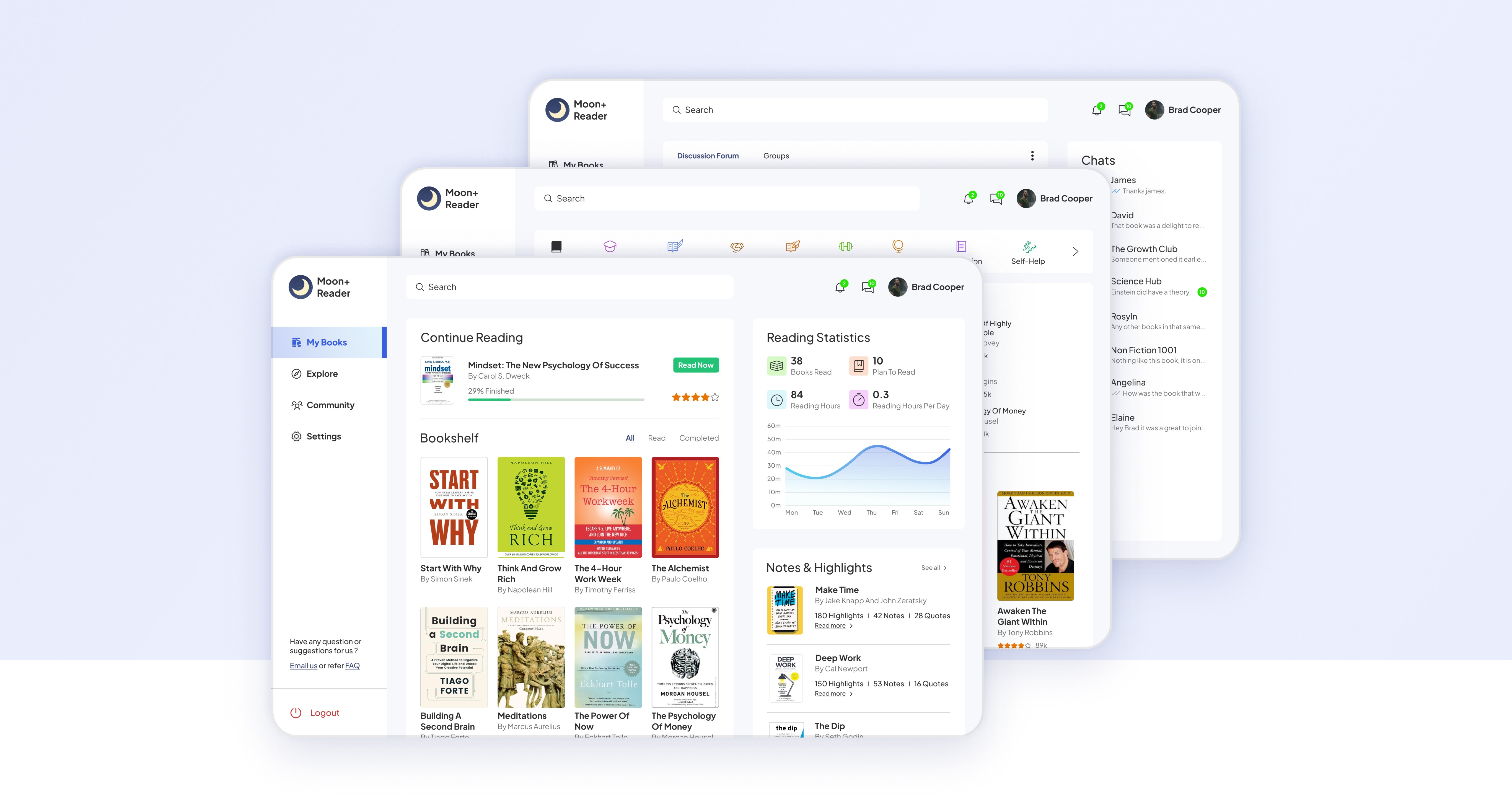


Moon+ Reader Dashboard
Moon+ Reader Dashboard
Expanding the business to new market while helping users to manage their books, exploring new ones and interact with other readers.
Expanding the business to new market while helping users to manage their books, exploring new ones and interact with other readers.
Unsolicited Design
Unsolicited Design
Unsolicited Design
UI Design
UI Design
UI Design
UX Design
UX Design
Web Design
Web Design
Education
Education
Timeframe - 1 Month
Unsolicited Design
UI Design
UX Design
Web Design
Education
Timeframe - 1 Month
Timeframe - 1 Month
Timeframe - 1 Month
Timeframe - 1 Month
Summary
Moon reader provides a nice experience with lots of customisation for reading. But when one wants to do the same on web - Desktop or Tablet, they don’t get one. All we currently have is a site which leads us to mobile app in playstore.
Since the market is crowded with sites for buying books, there are few which offers online reading with great communities to engage and share their thoughts. So expanding in this market will provide new opportunities for the company growth.

Vision
For Moon Reader to have a market share in book reading platform, we need to help the readers to quickly find books, maintain their bookshelves, help in their learning journey and engage with other readers of same interests. This would require us to make sure that the interface is simple, easily discoverable and usable by the readers.
The Beginning...
I searched online platforms which provides reading books and started making requirements for our dashboard. Sites like Goodreads, Open Library, The StoryGraph and LibraryThing were some of the sites that can give us the idea of what those requirements can be.
I searched online platforms which provides reading books and started making requirements for our dashboard. Sites like Goodreads, Open Library, The StoryGraph and LibraryThing were some of the sites that can give us the idea of what those requirements can be.
Synthesizing collected data into key insights :
Synthesizing collected data into key insights :





Home section gives an overview of what book is being read, reading lists, recommendation and community feeds.
Home section gives an overview of what book is being read, reading lists, recommendation and community feeds.
They have variety of features available to their readers like Books, Statistics, Notes and Highlights, Library, Groups and communities, challenges, etc.
They have variety of features available to their readers like Books, Statistics, Notes and Highlights, Library, Groups and communities, challenges, etc.
Separate sections for Browsing books and Community for discussions.
Separate sections for Browsing books and Community for discussions.
They can make friends with same interests and can host buddyreads and readalong with them. They can also publish their books on the platform.
They can make friends with same interests and can host buddyreads and readalong with them. They can also publish their books on the platform.
A separate section for book giveaways to the readers hosted by the Authors and publishers.
A separate section for book giveaways to the readers hosted by the Authors and publishers.
Sites like Goodreads and The Storygraph provide affiliate links to buy books while others like open library lets you borrow books which are available to public.
Sites like Goodreads and The Storygraph provide affiliate links to buy books while others like open library lets you borrow books which are available to public.
Requirements for our dashboard version 1.0
After assessing the websites, I wrote down the common features for the readers. Following features were decided to be made that would include further content related to them -
After assessing the websites, I wrote down the common features for the readers. Following features were decided to be made that would include further content related to them -
My Books


Main section consisting of books and information related to the readers.
Main section consisting of books and information related to the readers.
Explore



This would be the go to place for discovering new books to read.
This would be the go to place for discovering new books to read.
Community


A place for discussing on any books with others. They can also meet new readers, become friends and join groups.
Settings


For helping readers in setting and maintaining their account.
Community


A place for discussing on any books with others. They can also meet new readers, become friends and join groups.
Settings


For helping readers in setting and maintaining their account on Moon reader.
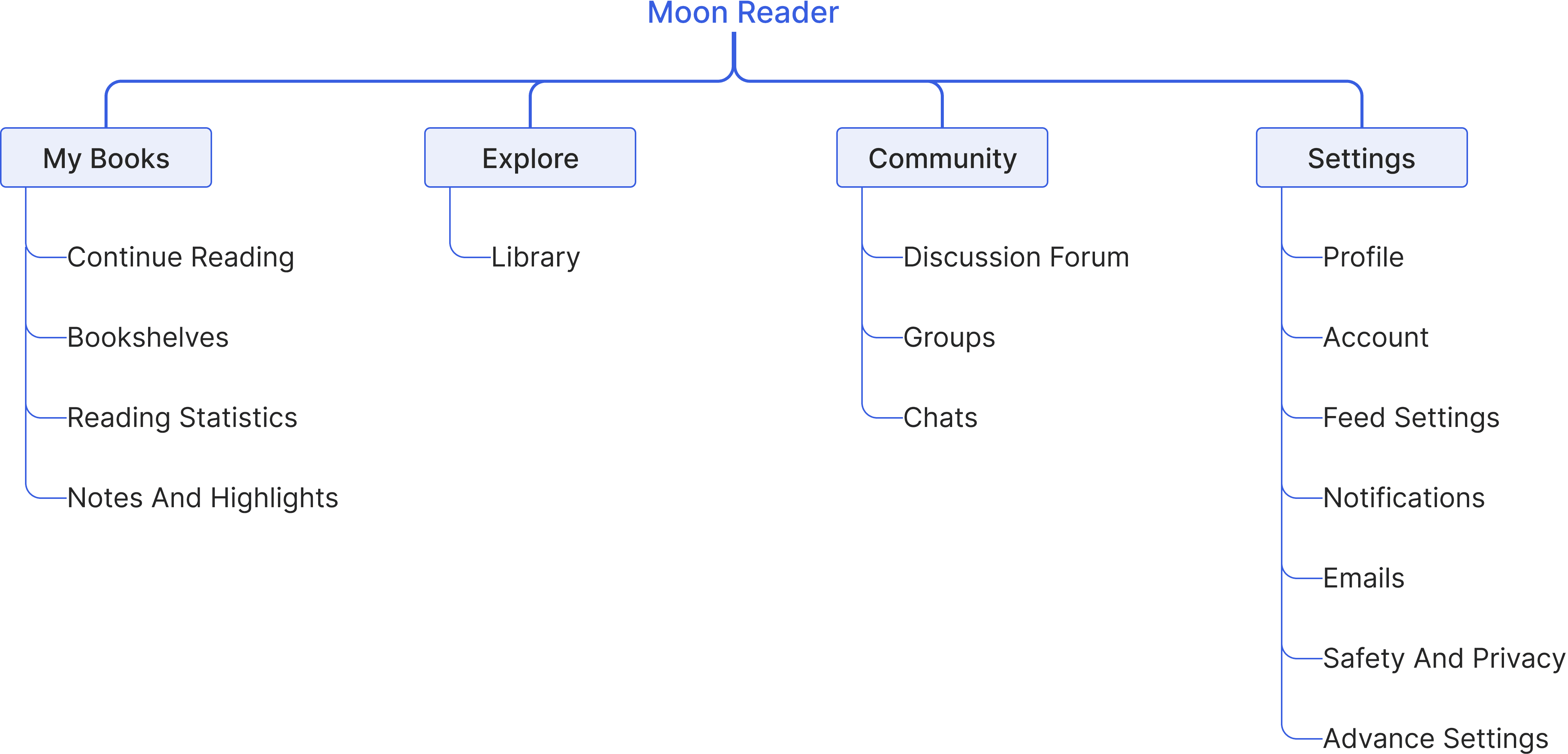
With the requirements set, I created the sitemap for our dashboard to understand clearly and further decide what to incorporate in our designs.
With the requirements set, I created the sitemap for our dashboard to understand clearly and further decide what to incorporate in our designs.


Starting the designs
I started with low fidelity wireframes to quickly understand the layout and placement of what and where they should be placed. Doing this gave the idea of making our design more clear while reducing any complexitiy.
I started with low fidelity wireframes to quickly understand the layout and placement of what and where they should be placed. Doing this gave the idea of making our design more clear while reducing any complexitiy.
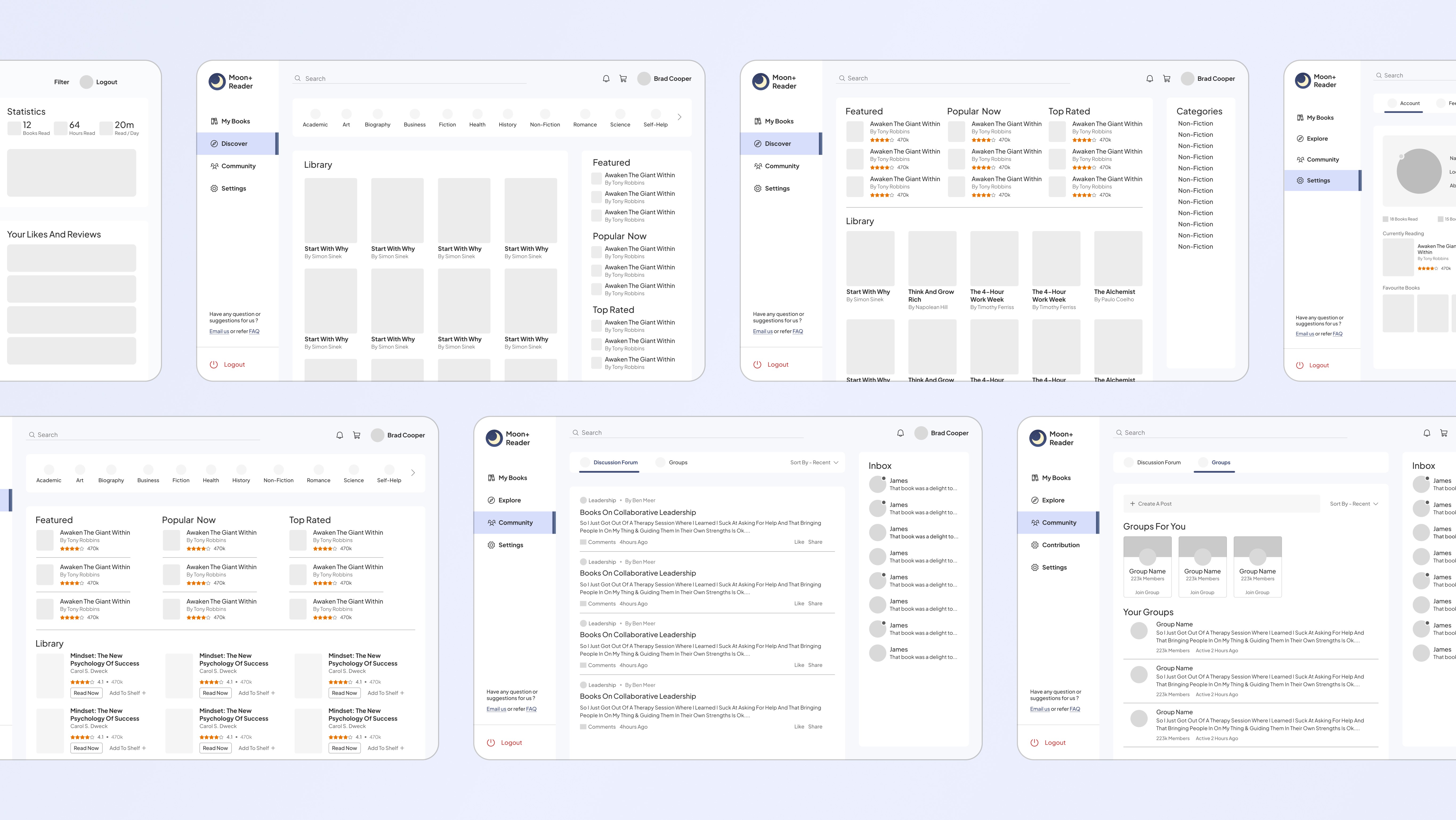
After low fidelity screens were made, it was time to turn our low fidelity designs to high fidelity designs with more details and making it closer to our Reader dashboard experience.
After low fidelity screens were made, it was time to turn our low fidelity designs to high fidelity designs with more details and making it closer to our Reader dashboard experience.
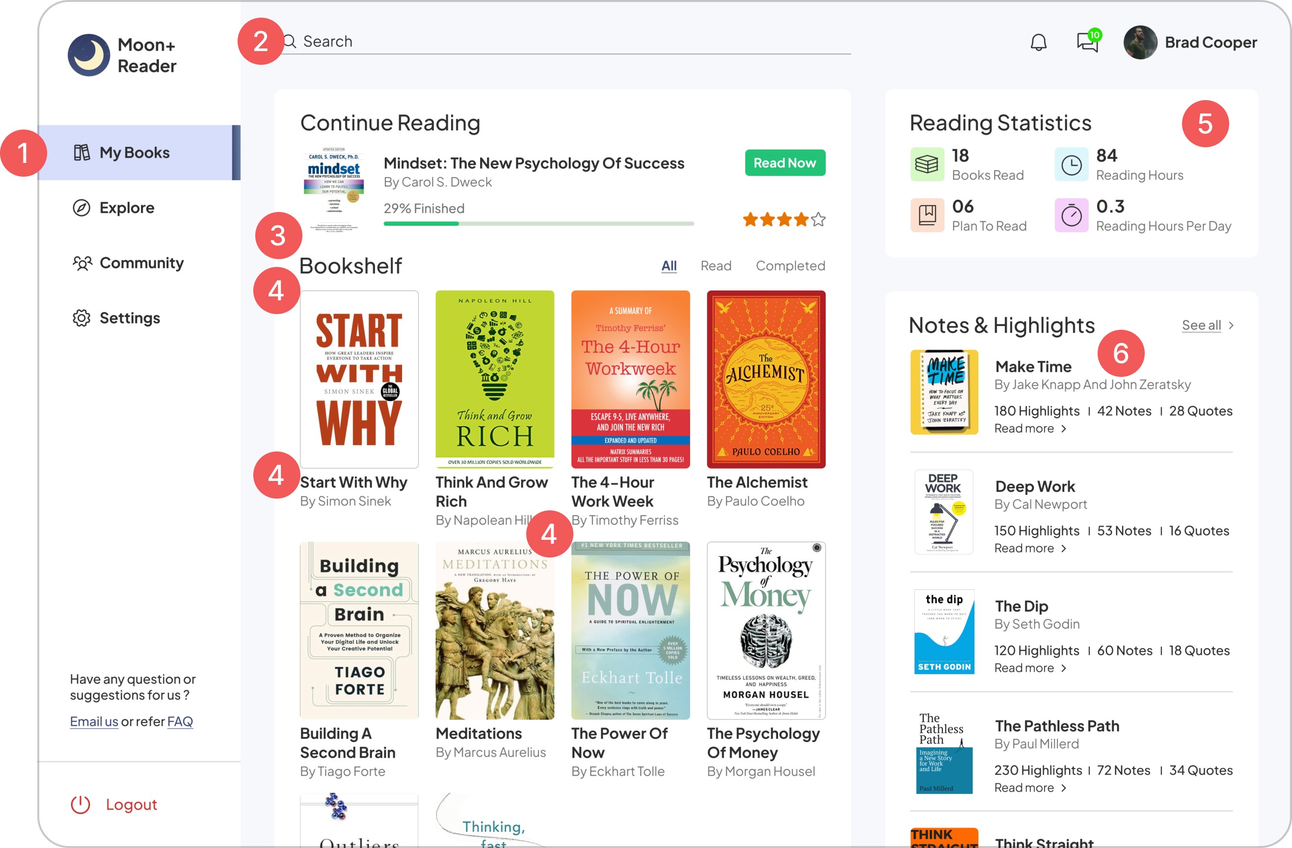
my books
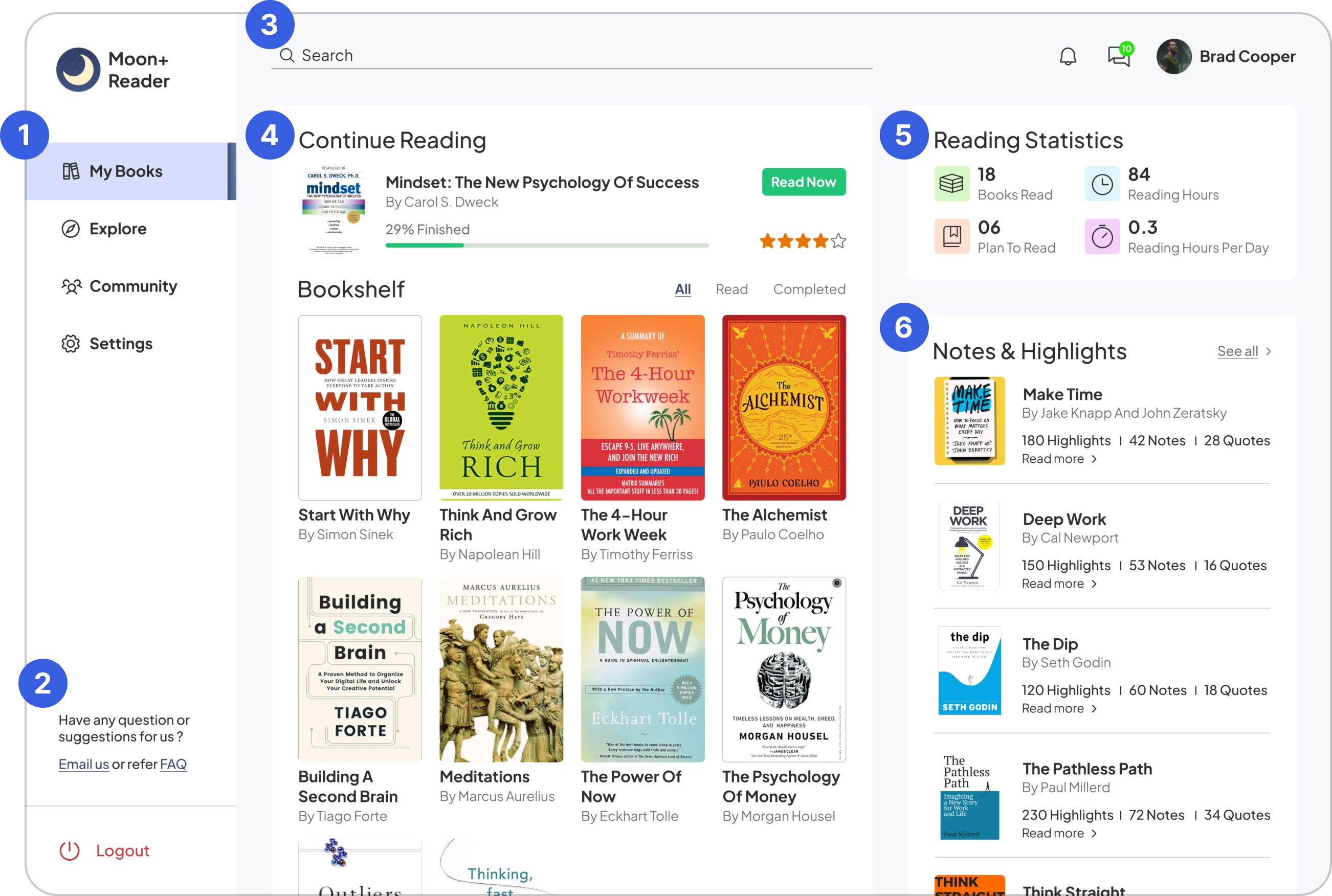
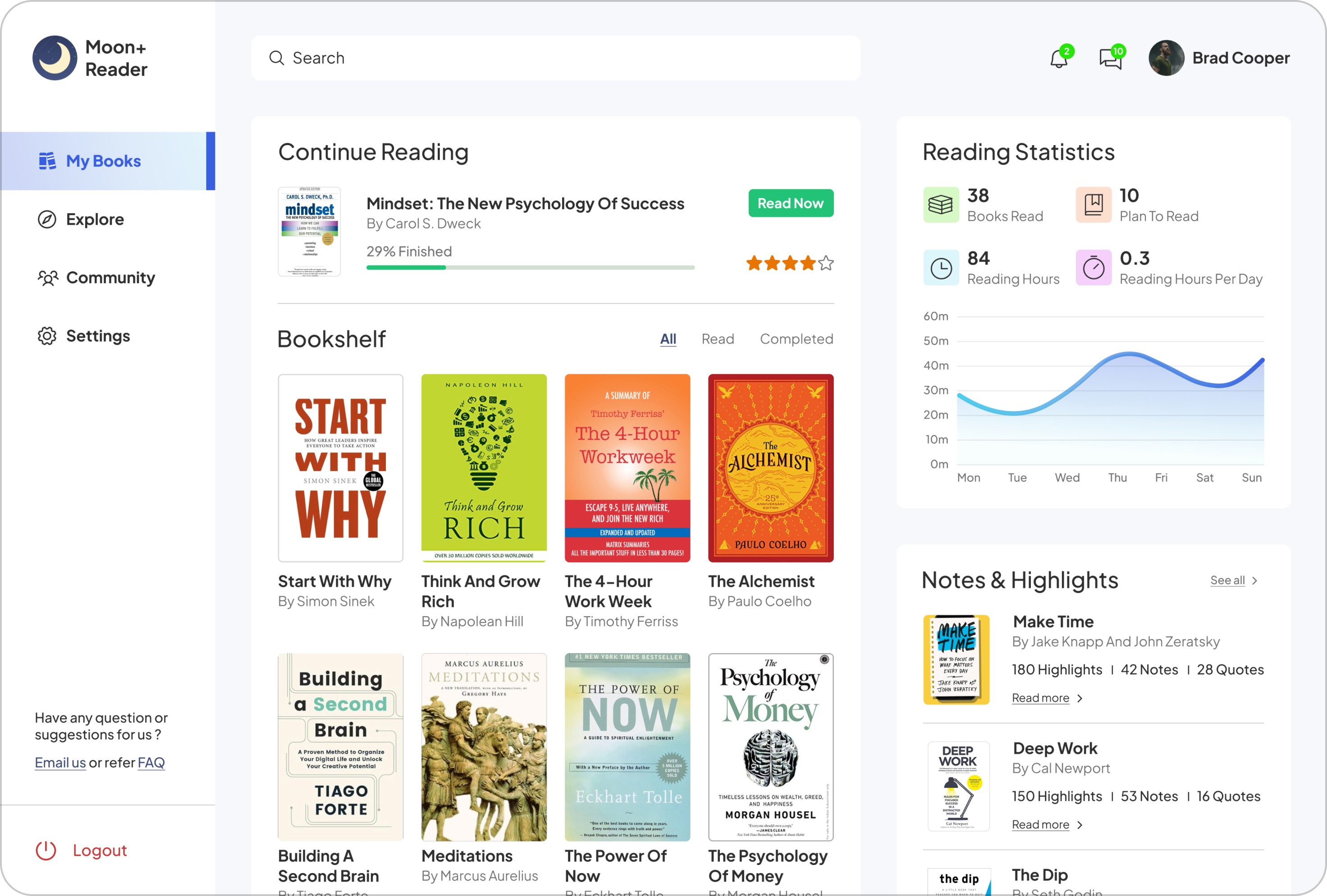
What would a reader need when they visit My Books Section?
What would a reader need when they visit My Books Section?

1
A side collapsible navigation menu consisting of main sections with faq and a way to provide feedback for better product development.
A side collapsible navigation menu consisting of main sections with faq and a way to provide feedback for better product development.
2
FAQ for any doubts or queries by the readers reducing the load on helping team. A feedback link is given for driving better product developmen.
FAQ for any doubts or queries by the readers reducing the load on helping team. A feedback link is given for driving better product developmen.
3
Search bar, Notifications, Messages and profile tab for faster access.
Search bar, Notifications, Messages and profile tab for faster access.
4
Last book read by the reader with their progress and a direct button to continue reading. Books saved gets stored in their bookshelves which can be accessed easily.
Last book read by the reader with their progress and a direct button to continue reading. Books saved gets stored in their bookshelves which can be accessed easily.
5
Reading statistics to let readers know their reading progress and set a reading habit.
Reading statistics to let readers know their reading progress and set a reading habit.
6
For each book they have read, Notes & highlights are shown so that they can retrieve the learnings easily.
For each book they have read, Notes & highlights are shown so that they can retrieve the learnings easily.
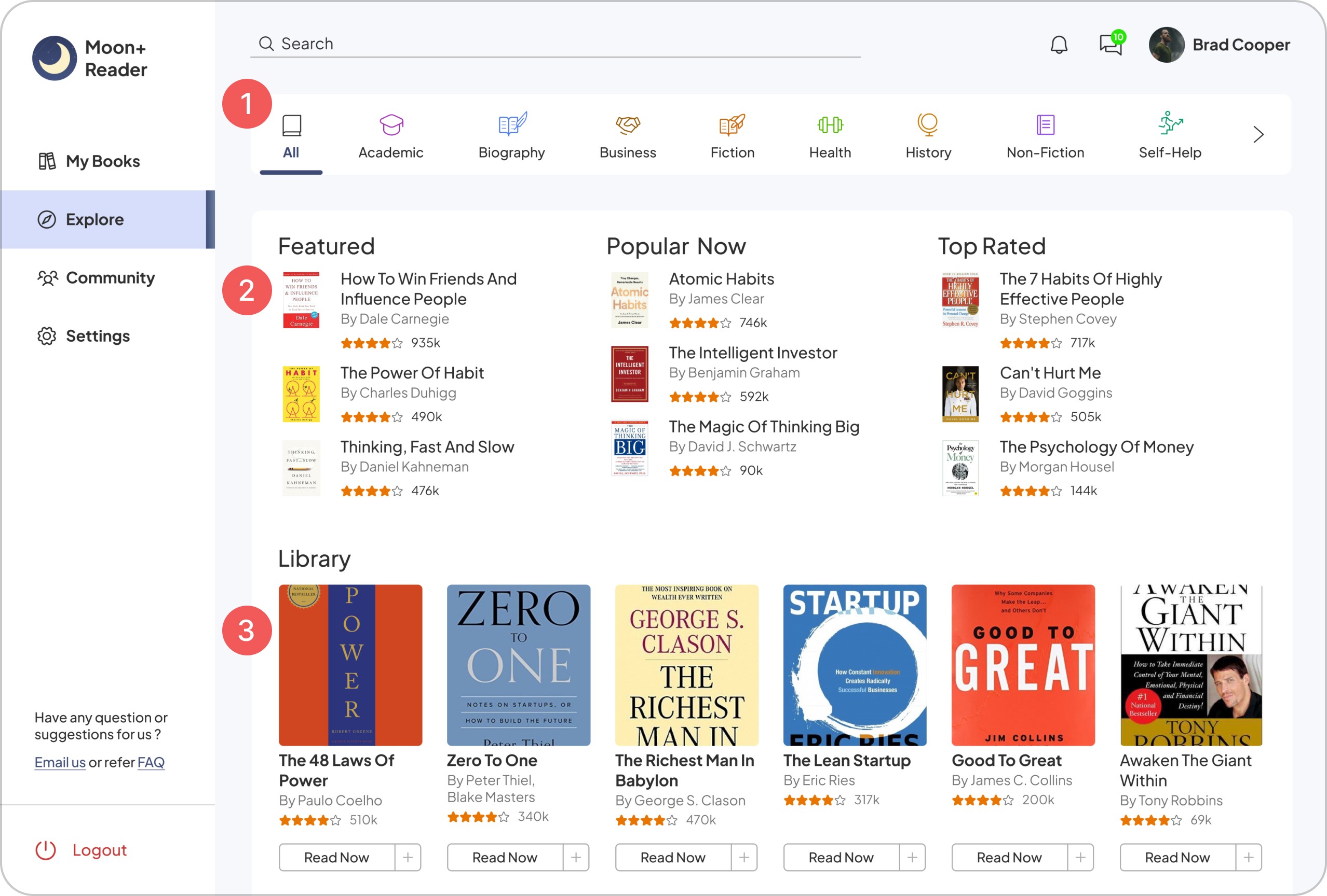
explore
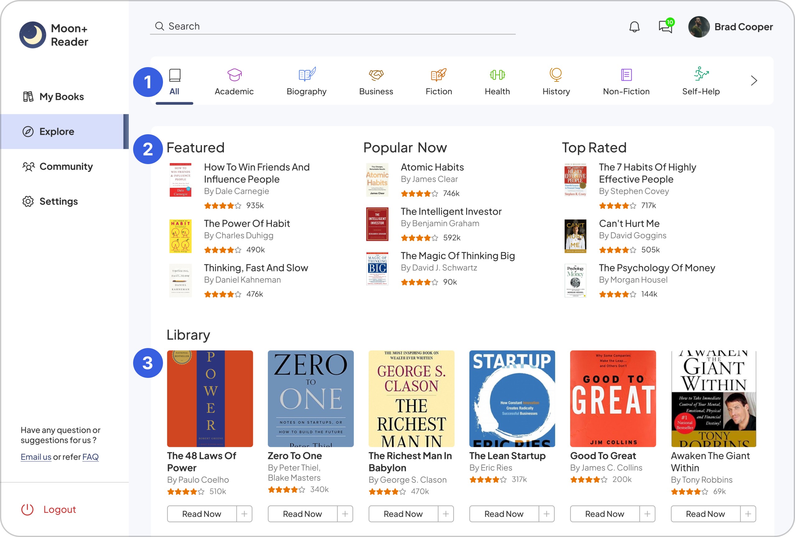
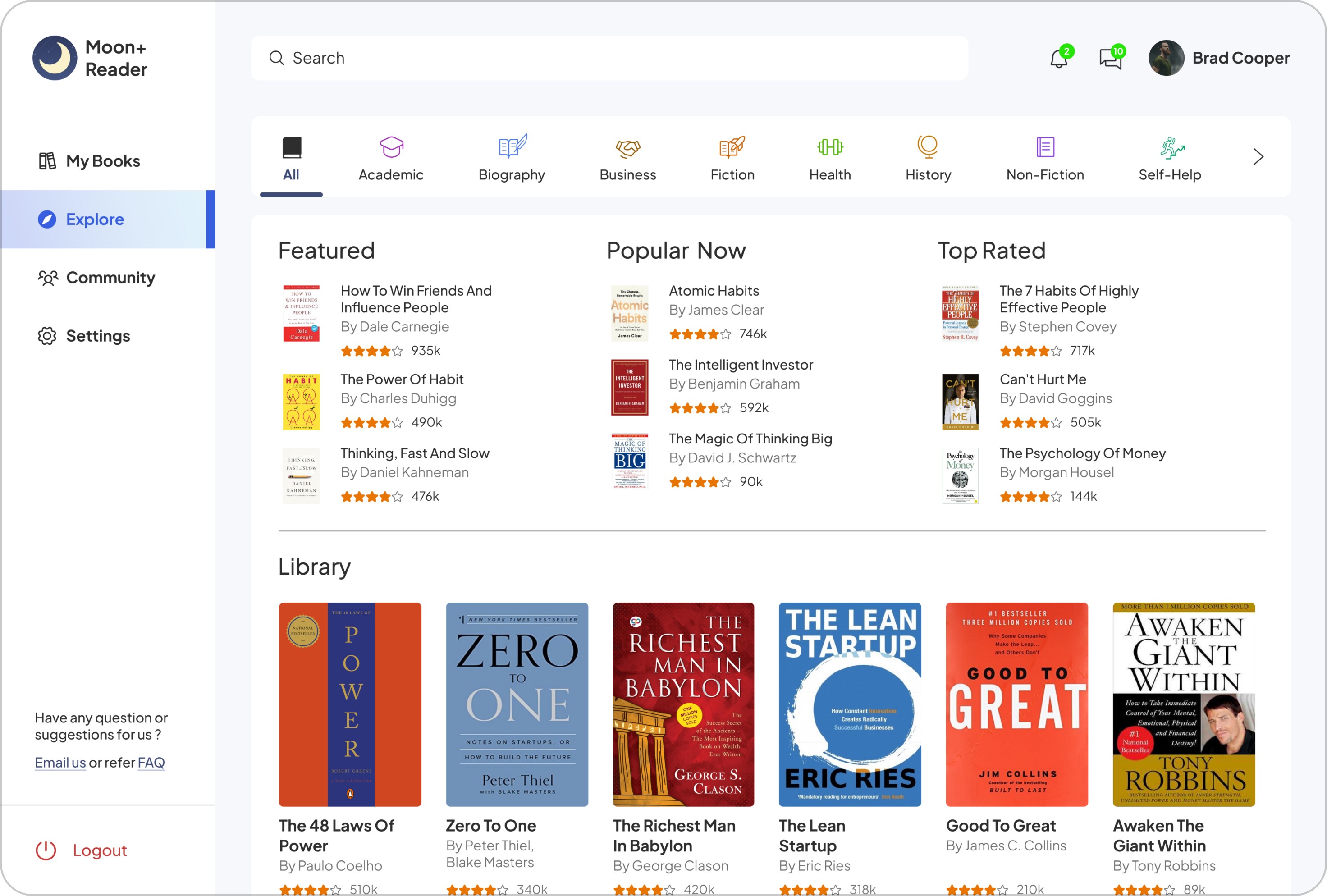
What would a reader expect when they open this screen and how can we help them in discovering books that might interests them and provide good suggestions?
What would a reader expect when they open this screen and how can we help them in discovering books that might interests them and provide good suggestions?


1
Book categories are placed at the top for easy browsing based on readers interests.
Book categories are placed at the top for easy browsing based on readers interests.
2
Book recommendations - Featured, Popular and Top rated are shown before the Library to let readers know what books are being read by the community.
Book recommendations - Featured, Popular and Top rated are shown before the Library to let readers know what books are being read by the community.
3
In Library, books are shown with a button to read the book directly reducing the no. of clicks or to add to their bookshelves.
In Library, books are shown with a button to read the book directly reducing the no. of clicks or to add to their bookshelves.
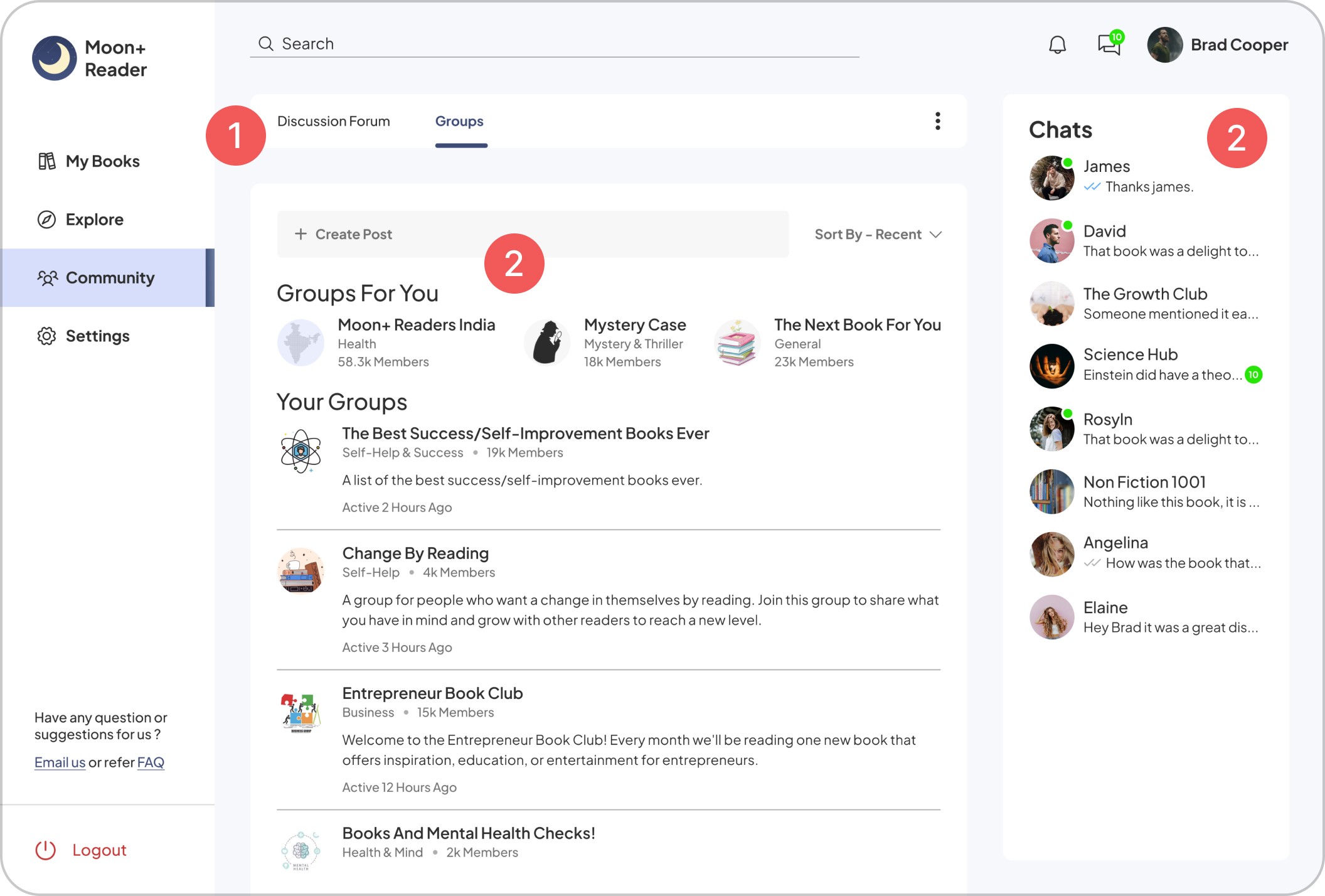
community
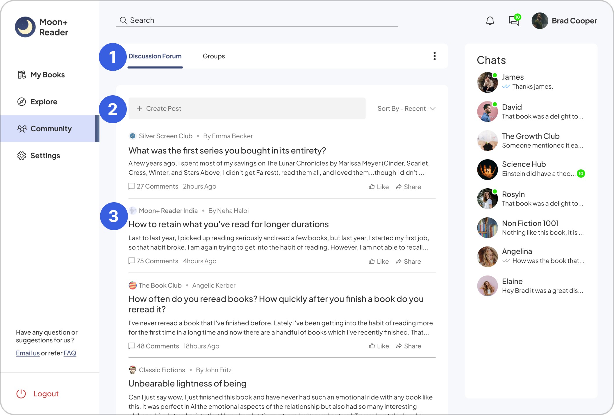
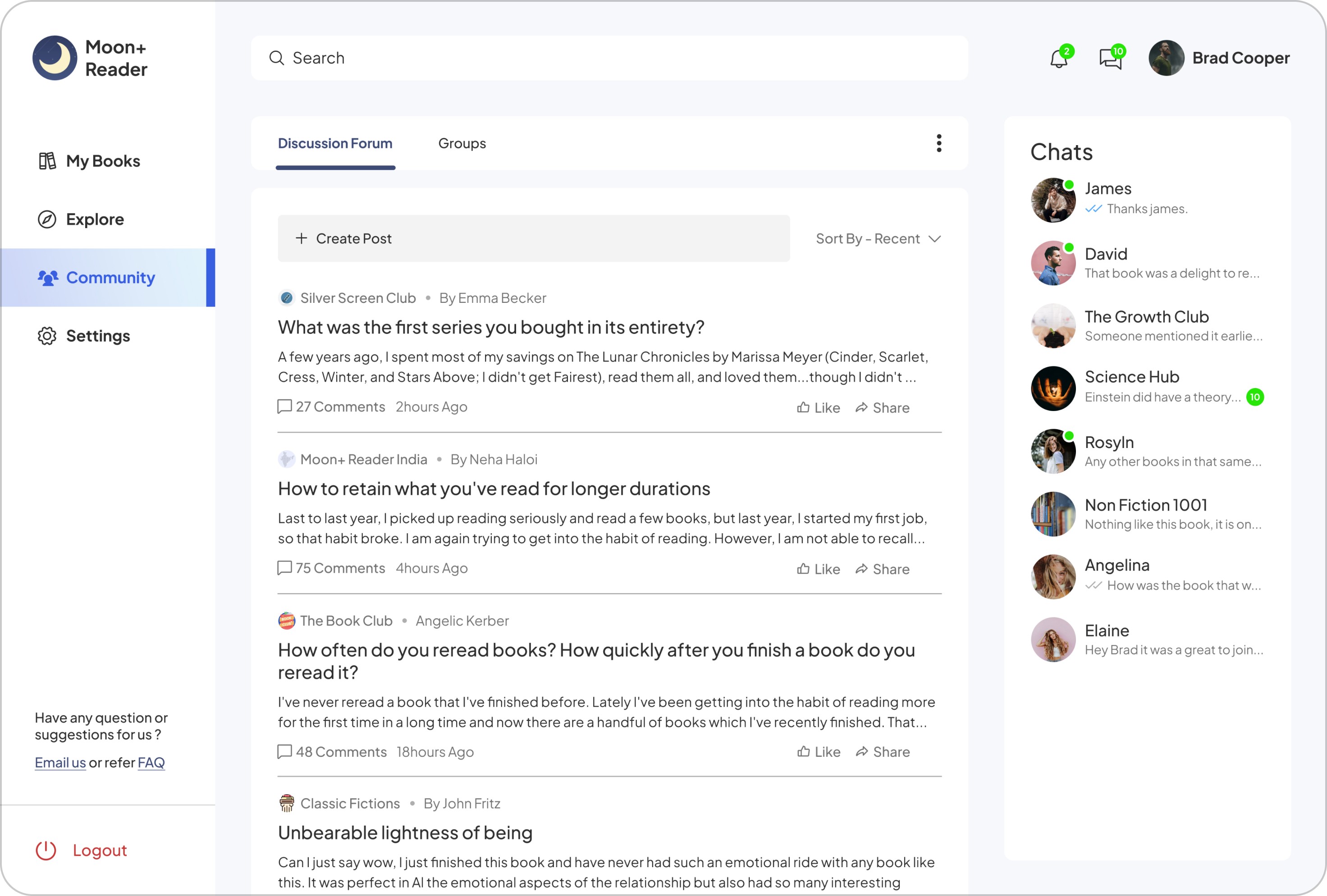
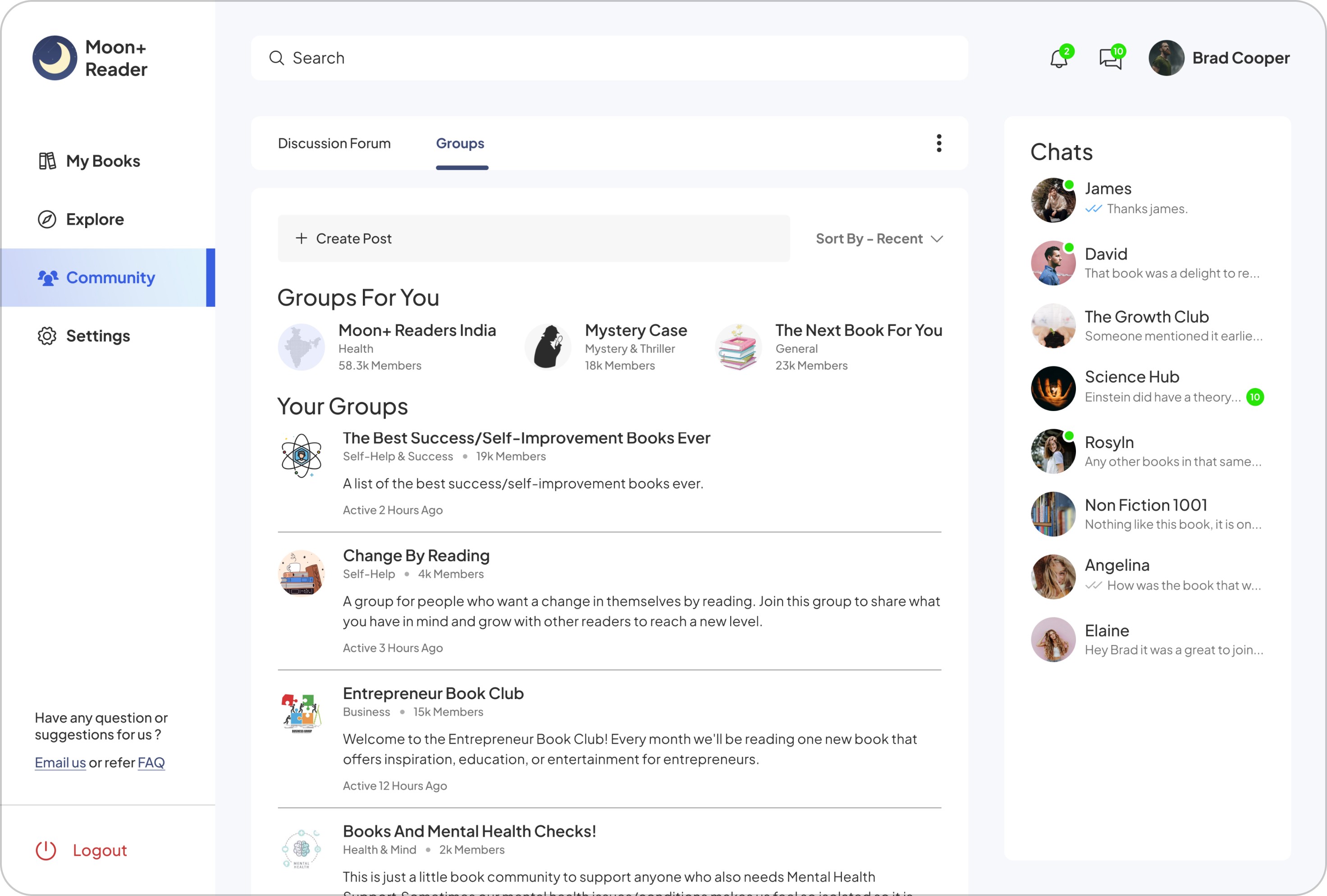
How can we help readers in engaging with the community - join groups that interests them and discuss on topic or books that they have read?
How can we help readers in engaging with the community - join groups that interests them and discuss on topic or books that they have read?


1
Discussion and Groups are placed at the top for easy switching between community feeds and specific group discussions.
Discussion and Groups are placed at the top for easy switching between community feeds and specific group discussions.
2
Readers can create post or use sorting to set their feeds as per their needs.
Readers can create post or use sorting to set their feeds as per their needs.
3
Discussion posts are separated and readers can see what topics are being discussed from which group. This would help them to engage with topics that interests them and share it in one tap.
Discussion posts are separated and readers can see what topics are being discussed from which group. This would help them to engage with topics that interests them and share it in one tap.


4
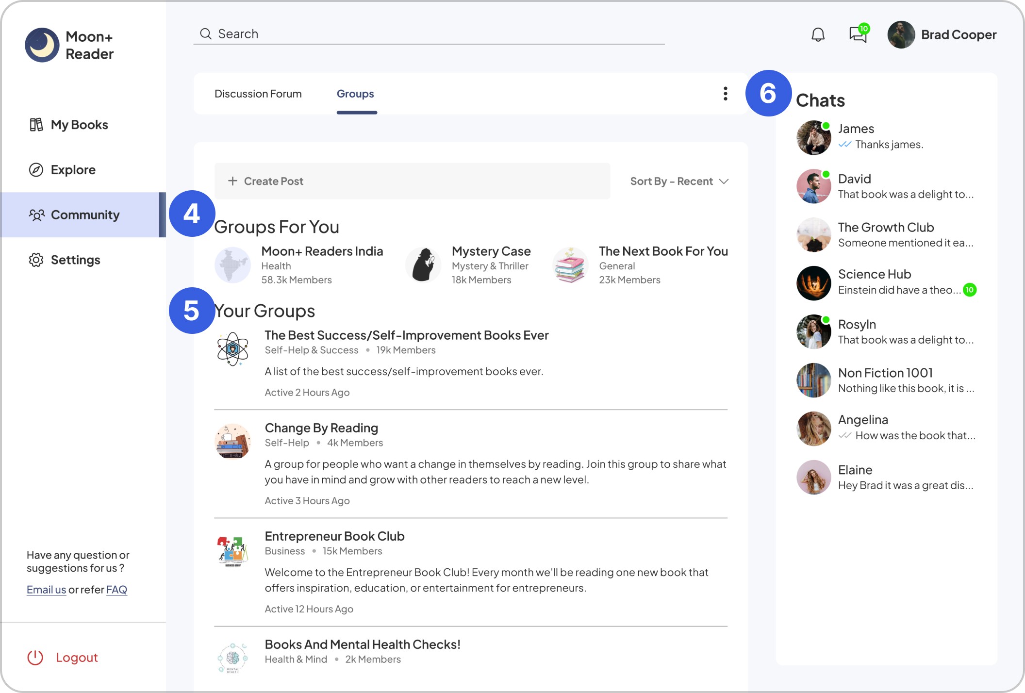
Groups recommended to the reader based on their interests and activity.
Groups recommended to the reader based on their interests and activity.
5
Readers group lists with name, category, total members and a brief description with their last active discussion which would let the readers know of recent group activity.
Readers group lists with name, category, total members and a brief description with their last active discussion which would let the readers know of recent group activity.
6
Chats from friends the reader met in the community and groups for more personalised messages.
Chats from friends the reader met in the community and groups for more personalised messages.
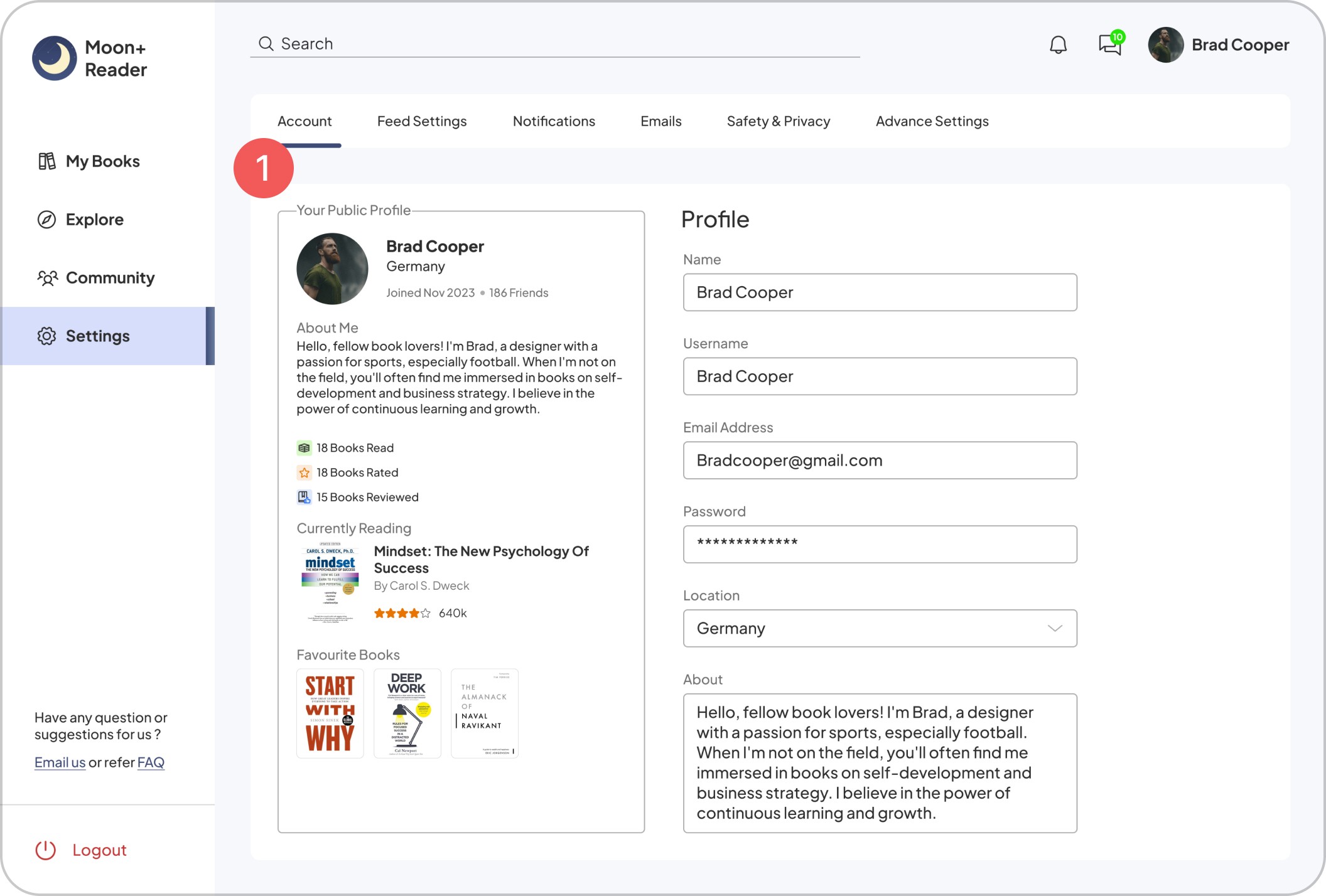
settings
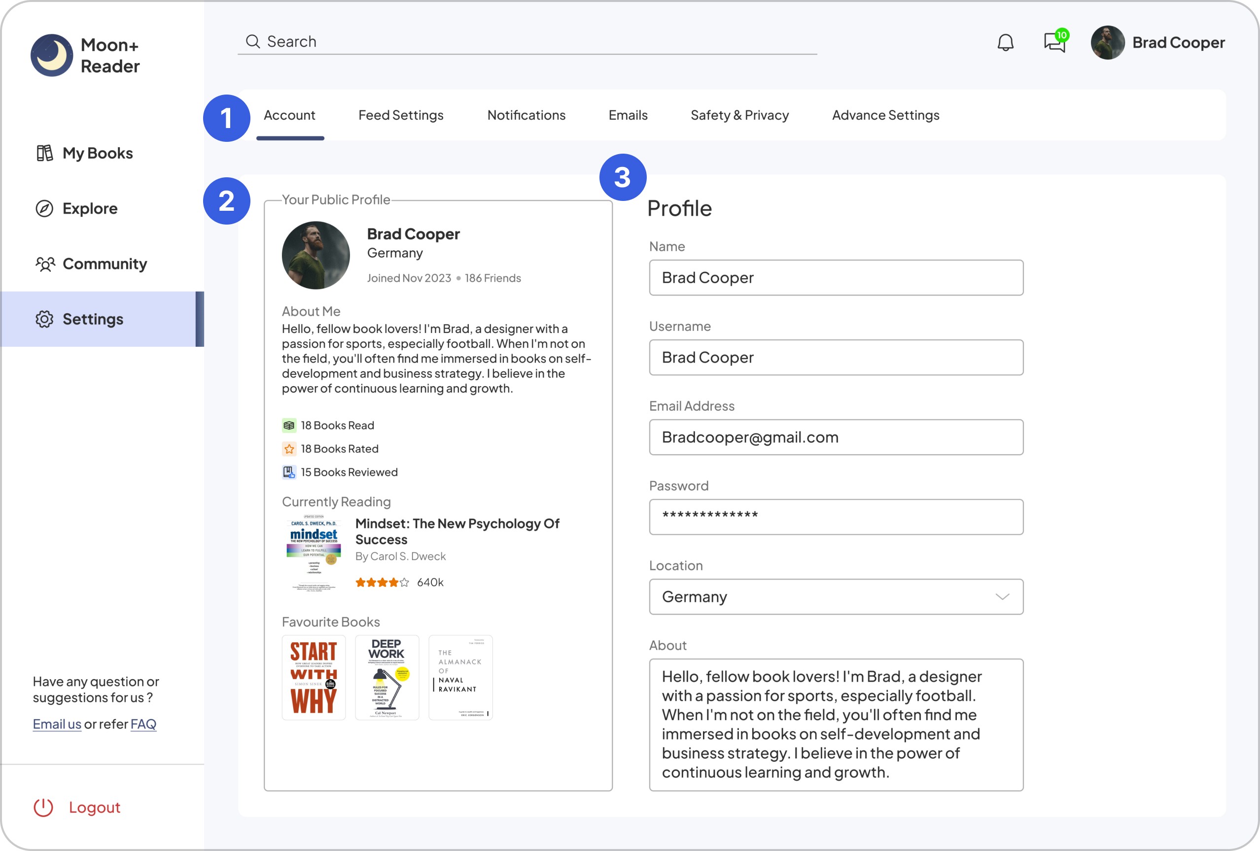
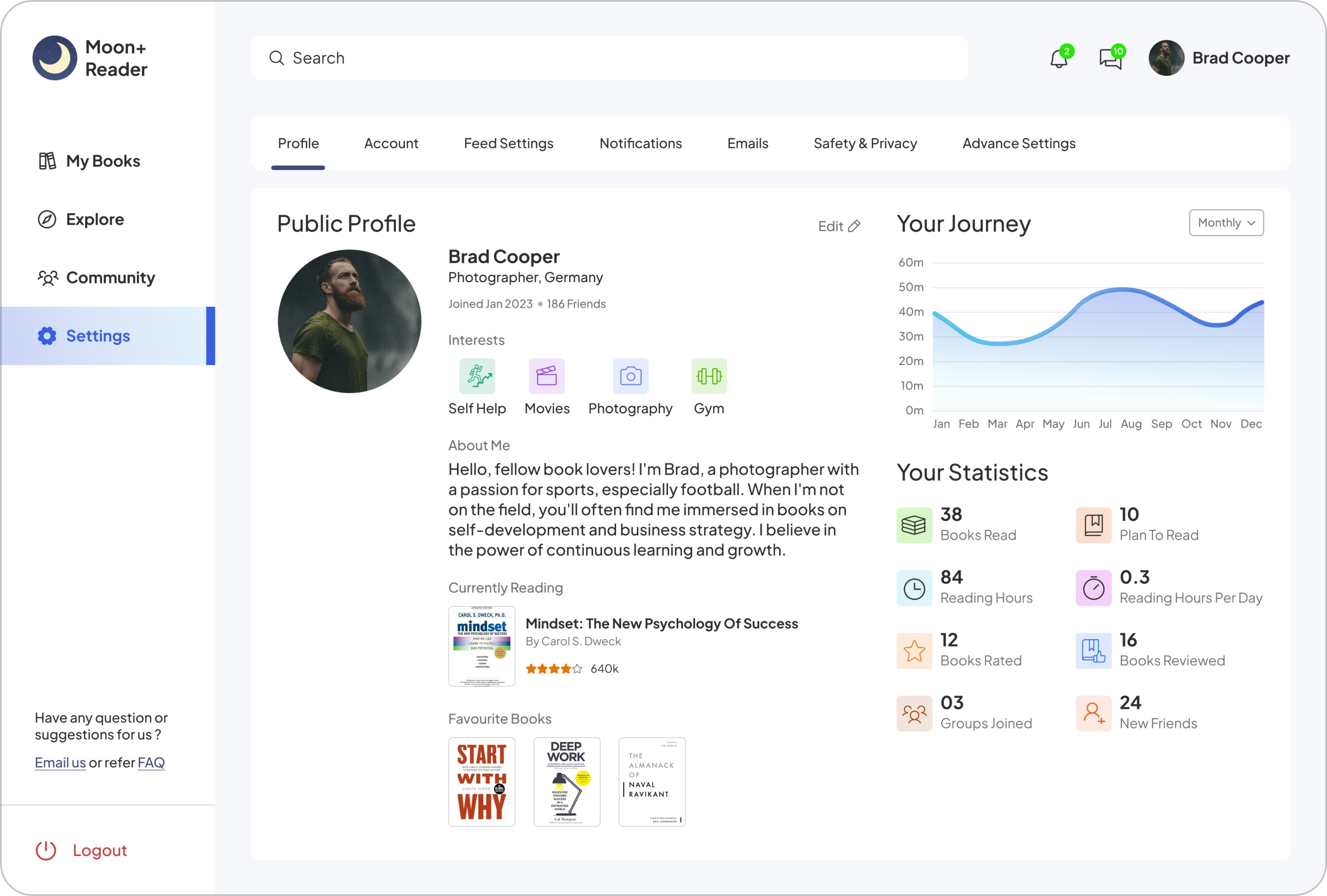
How can we help readers in managing their account and control their public profile?
How can we help readers in managing their account and control their public profile?


1
Important settings are provided to take control of their profile and data at the top section for clear navigation.
Important settings are provided to take control of their profile and data at the top section for clear navigation.
2
A Preview of public profile helping readers to know what can be seen by others when they visit their profile.
A Preview of public profile helping readers to know what can be seen by others when they visit their profile.
3
Profile editing section for readers to enter their information.
Profile editing section for readers to enter their information.
Getting feedback for the design
After finishing my first high fidelity designs, I sought critique from senior designers and fellow peers. I got some insightful feedbacks, and implemented several key points to ensure those issues are addressed.
After finishing my first high fidelity designs, I sought critique from senior designers and fellow peers. I got some insightful feedbacks, and implemented several key points to ensure those issues are addressed.


1
Can be more prominent in terms of their active state.
Can be more prominent in terms of their active state.
2
Use of solid fill icon to show it in active state and use of gradient fill to make it more interesting.
Use of solid fill icon to show it in active state and use of gradient fill to make it more interesting.
2
Search bar looks disabled.
Search bar looks disabled.
2
Use of solid white background to make it more visible to our readers.
Use of solid white background to make it more visible to our readers.
3
Need to separate continue reading and bookshelves.
Need to separate continue reading and bookshelves.
2
Using a separator line between the section.
Using a separator line between the section.
4
Books title and cover are close to one another and between each other.
Books title and cover are close to one another and between each other.
2
More white space for better separation.
More white space.
5
Statistics section can be more appealing.
Statistics section can be more appealing.
2
Addition of graph for better understanding of their weekly reading progress.
Addition of graph for better understanding of their weekly reading progress.
6
Book information alignment and font size of Read more button.
Book information alignment and font size of Read more button.
2
Text aligned to book top and making Read more button smaller with an inline link.
Text aligned to book top and making Read more button smaller with an inline link.


1
Categories can be more prominent to let readers know which one is currently selected.
Categories can be more prominent to let readers know which one is currently selected.
2
Using solid fill colour will make the selection visually clear to our readers.
Using solid fill colour will make the selection visually clear to our readers.
2
Proper Hierarchy of the recommended books section.
Proper Hierarchy of the recommended books section.
2
Reducing the font size of the book title reduces clash with the Section title.
Reducing the font size of the book title reduces clash with the Section title.
3
Book cover is cropped and white spacing in between the elements.
Book cover is cropped and white spacing in between the elements.
2
Book cover set full height resulting in big cover images and white spacing was increased in-between the elements.
Book cover set full height resulting in big cover images and white spacing was increased in-between the elements.


1
Too much distance between the sections.
Too much distance between the sections.
Two
White spacing is reduced to visually show that both the sections are related.
White spacing is reduced to visually show that both the sections are related.
2
Proper hierarchy in group suggestions and Chats.
Proper hierarchy in group suggestions and Chats.
2
Font size is reduced to show importance to group and persons name in chats. Font colours for messages is changed for proper hierarchy.
Font size is reduced to show importance to group and persons name in chats. Font colours for messages is changed for proper hierarchy.


1
Whole section for profile settings can be improved and the form field looked like disabled or is in editing mode.
Whole section for profile settings can be improved and the form field looked like disabled or is in editing mode.
2
New design is created separating account and profile settings. More features are added for public viewing and edit profile option is given.
New design is created separating account and profile settings. More features are added for public viewing and edit profile option is given.
Colours, Fonts and Grids
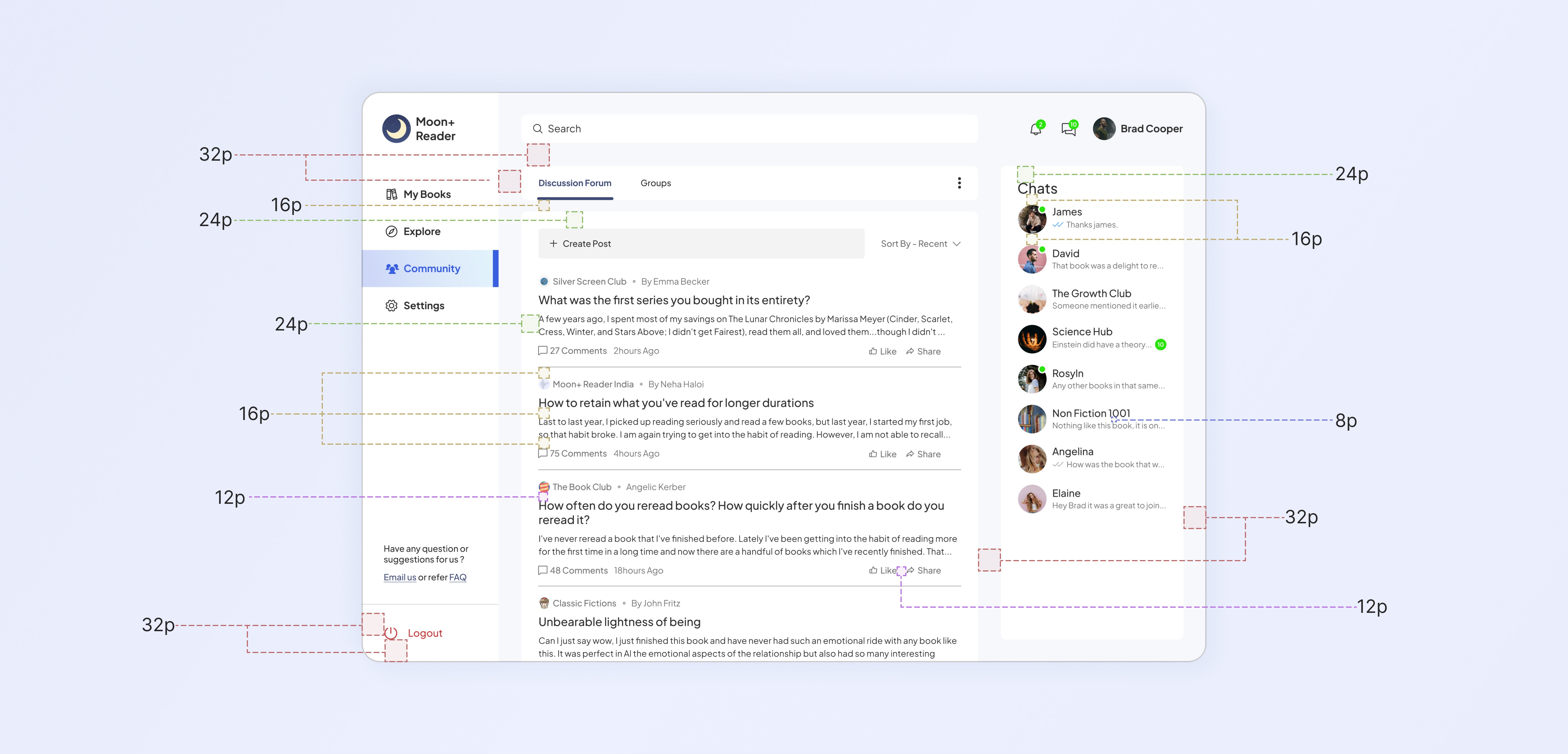
I picked the 8 point grid system for our dashboard project. Within the group - 8, 12, 16 and 24 grids were used to create a clean interface and show visual hierarchy between the sections and their elements.
I picked the 8 point grid system for our dashboard project. Within the group - 8, 12, 16 and 24 grids were used to create a clean interface and show visual hierarchy between the sections and their elements.
Colour palette
Colour palette
Brand, Primary, Secondary, Tertiary, Background
Font
Font
Satoshi - Regular, Medium and Bold
AaBbCcDdEeFfGgHh
AaBbCcDdEeFfGgHh
AaBbCcDdEeFfGgHh

Updated screens for our Dashboard
After getting feedback, new designs were created taking the issues into account while making sure that our design does not get complicated. I again explored variations to know which one would better suit our readers needs while reducing any important features that they might require.
After getting feedback, new designs were created taking the issues into account while making sure that our design does not get complicated. I again explored variations to know which one would better suit our readers needs while reducing any important features that they might require.










Taking a closer look at our exploration
continue reading
continue reading


Other versions for the card that were not used -
Other versions for the card not used -


Border on the card and cta made it visually unbalanced.


Too much white space. Progress and cta are too close as well.


Elements clashing and contrast issues.


Contrast and white space issues. Book cover and cta are not balanced.


Contrast issue and readers may confuse with only 29% written.
Contrast issue and readers may confuse with only 29% written.


Empty with no cta and a confusing number.
Too empty with no cta.
book recommendation
book recommendation


Other versions for the card that were not used -
Other versions for the card not used -


Empty and blank - readers may lose interest in the book.


The dot separator may confuse the readers. Looks empty as well.


Repeating the ratings in numbers does not add much.
Repeating the ratings in numbers does not add much.
book preview
book preview
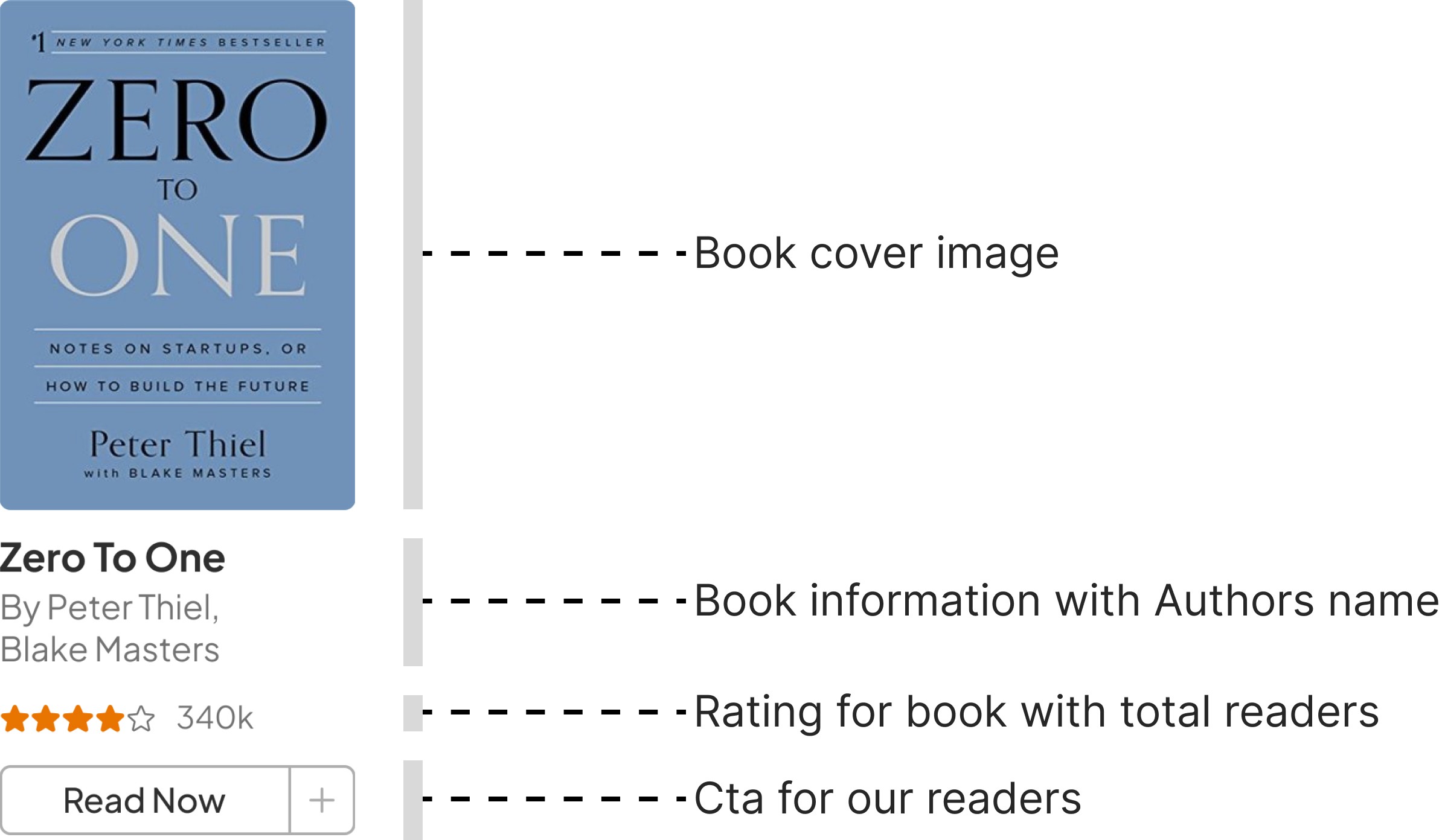

An alternate version in landscape was explored but since the books in Library were decided to be portrait, we did not use this version.
An alternate version in landscape was explored but since the books in Library were decided to be portrait, we did not use this version.


Other versions for the card that were not used -
Other versions for the card not used -


Read now and add books buttons are separated.


Too simple, readers may need ratings to decide whether to read it or not.
Readers may need ratings for book reading decision.

Read now button is less visible compared to add books button.
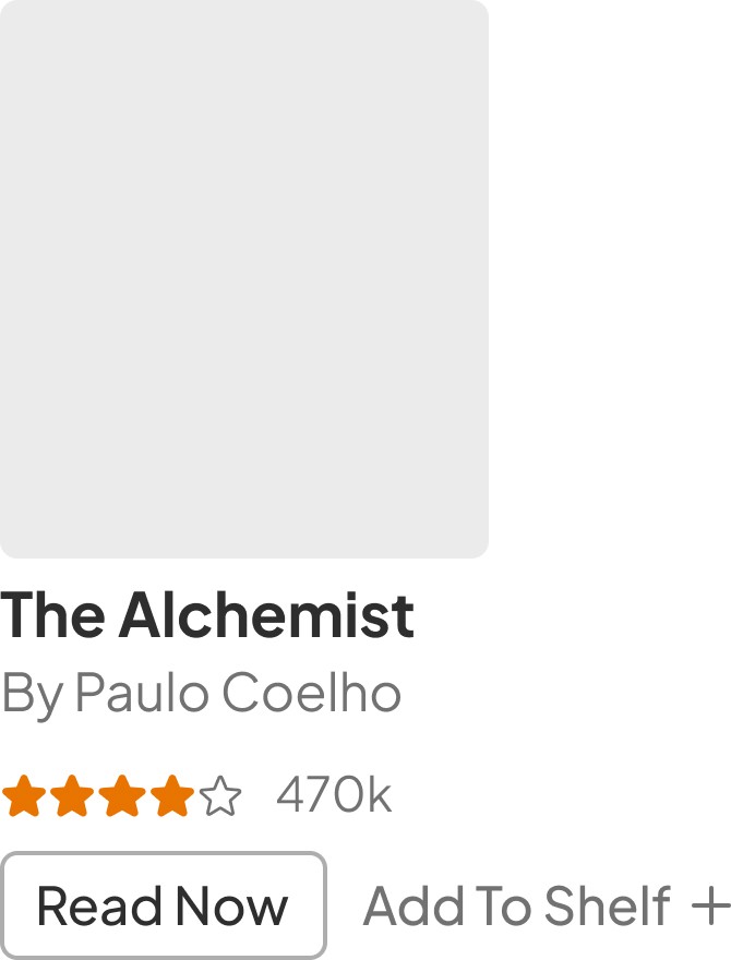
Add to shelf takes more space and expands beyond books preview.


Read now button is less visible compared to add books button.


Add to shelf takes more space and expands beyond books preview.
Conclusion
Starting a design from scratch required a navigation point which was developed from researching and looking into existing competition in the field.
Starting a design from scratch required a navigation point which was developed from researching and looking into existing competition in the field.
There were lots of features like Audiobooks, giveaways, publishing books, buying books through affiliation, etc that could become part of our first Dashboard version. But they might overwhelm our readers so I decided not to include them but to have them planned for the future release of the product.
There were lots of features like Audiobooks, giveaways, publishing books, buying books through affiliation, etc that could become part of our first Dashboard version. But they might overwhelm our readers so I decided not to include them but to have them planned for the future release of the product.
This also helped me to develop my understanding of a product by starting small and from there develop it further following the companies vision of what the product wants to achieve. We can also experiment designing our dashboard with a horizontal top navigation menu as well.
This also helped me to develop my understanding of a product by starting small and from there develop it further following the companies vision of what the product wants to achieve. We can also experiment designing our dashboard with a horizontal top navigation menu as well.
Let’s Chat and
Collaborate
I'd love to learn more about you and what we can design and build together.
Thanks for the visit. Have a Nice day!
Let’s Chat and Collaborate
I'd love to learn more about you and what we can design and build together.
Thanks for the visit. Have a Nice day!
Let’s Chat and
Collaborate
I'd love to learn more about you and what we can design and build together.
Thanks for the visit. Have a Nice day!